CHELSEA F.C.
CONCEPT VISUAL IDENTITY
THE REBIRTH OF AN ICON. A MODERN IDENTITY INSPIRED BY CHELSEA’S FOOTBALLING HERITAGE.
THE CREST.
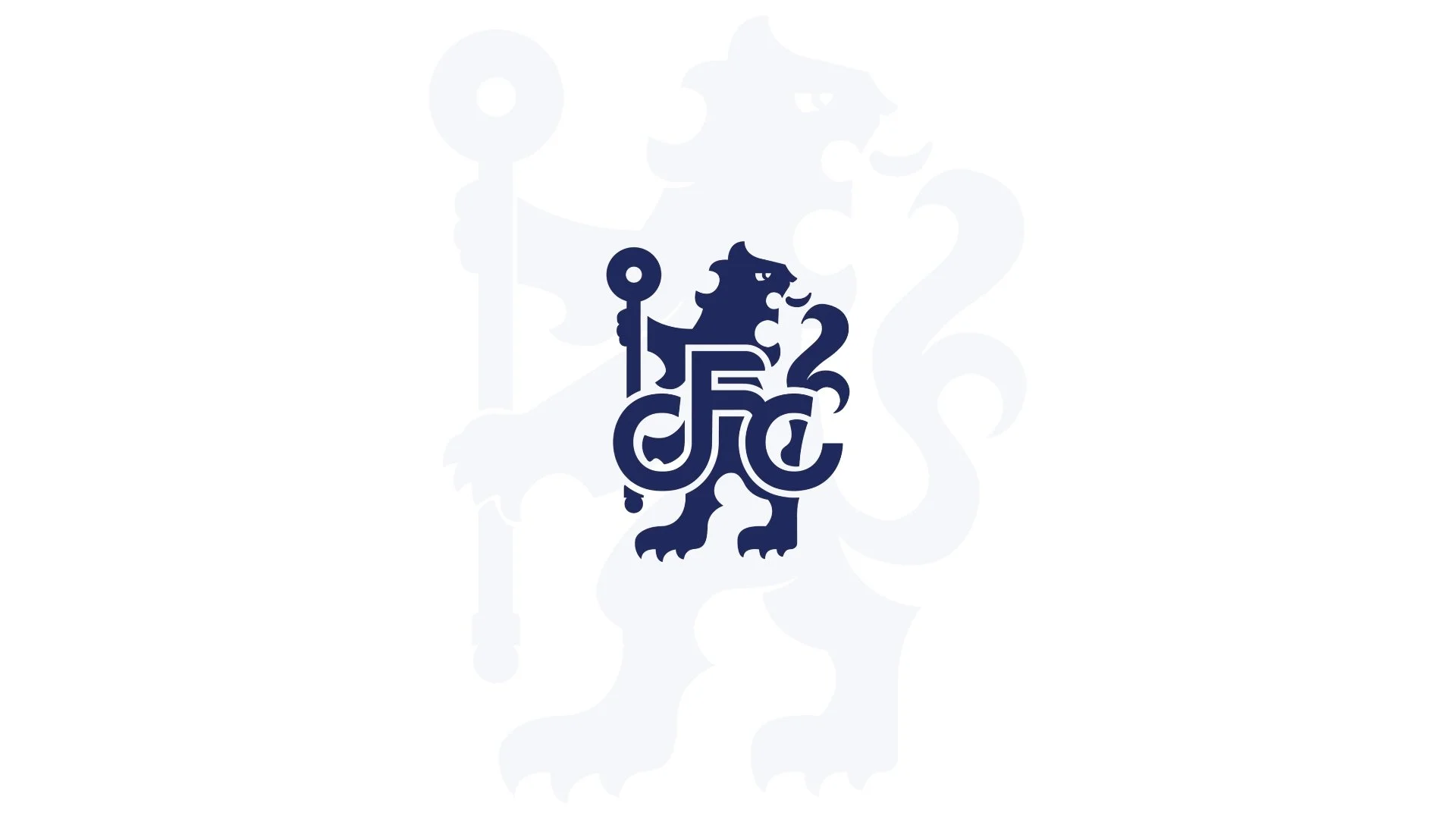
The Chelsea crest, featuring the Rampant Lion, is a historic symbol which holds tremendous meaning for fans worldwide. The lion is derived from the Arms of Earl Cadogan, who also holds as one of his subsidiary titles that of Viscount Chelsea. The crozier is that of the Abbot of Westminster, whose jurisdiction extended over the borough of Chelsea. The new visual identity was made to translate Chelsea Football Club into a digital age, while maintaining the heritage the club was built on.
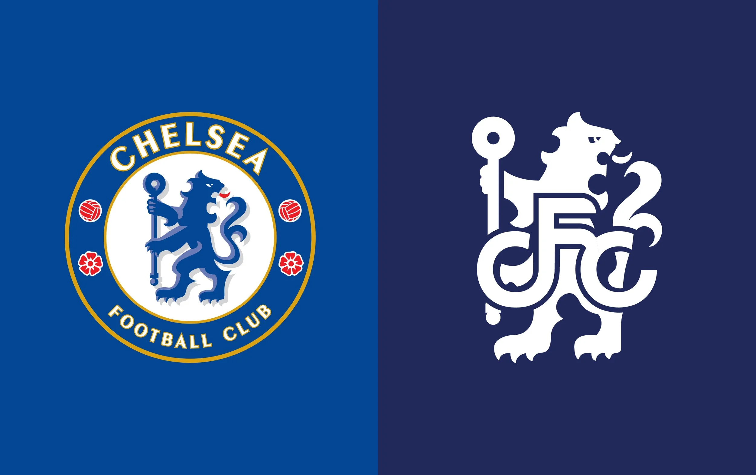
OLD
NEW
HERITAGE REIMAGINED.
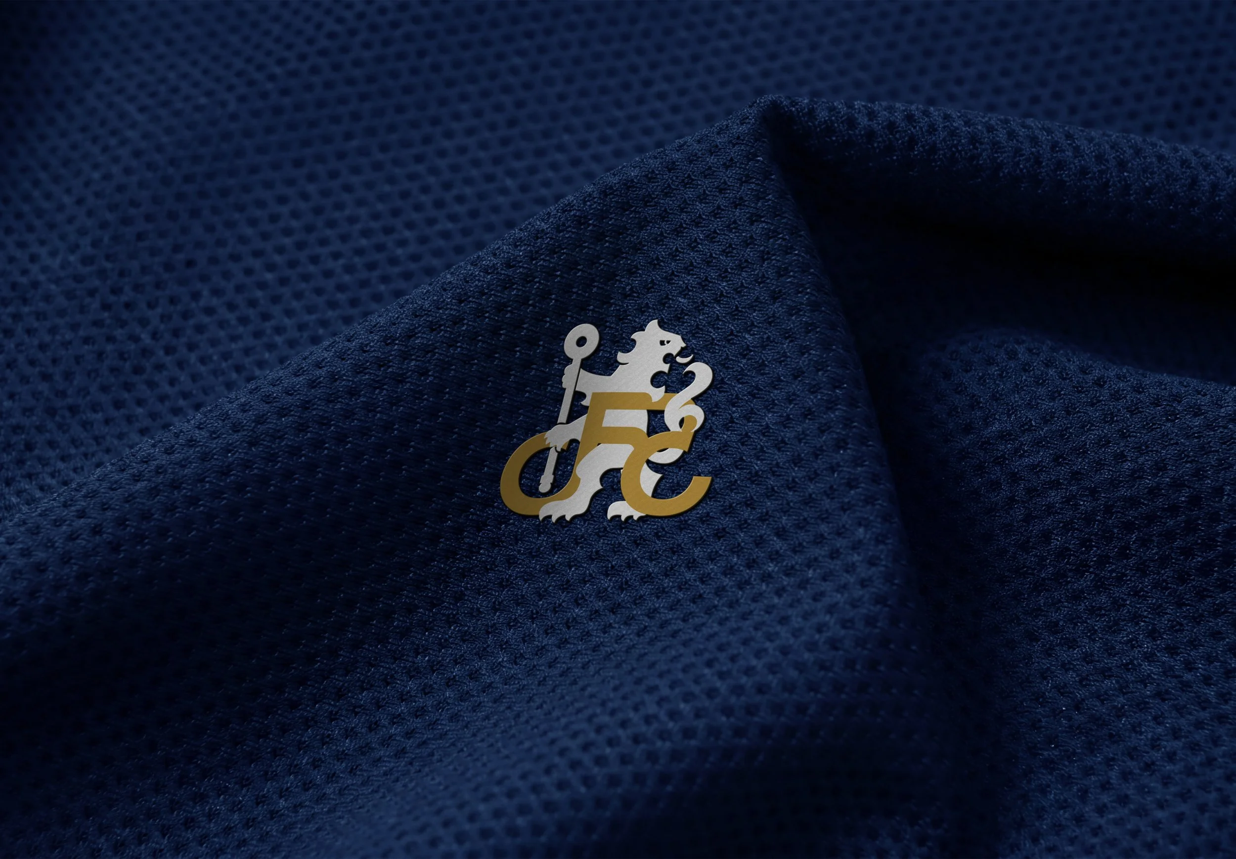
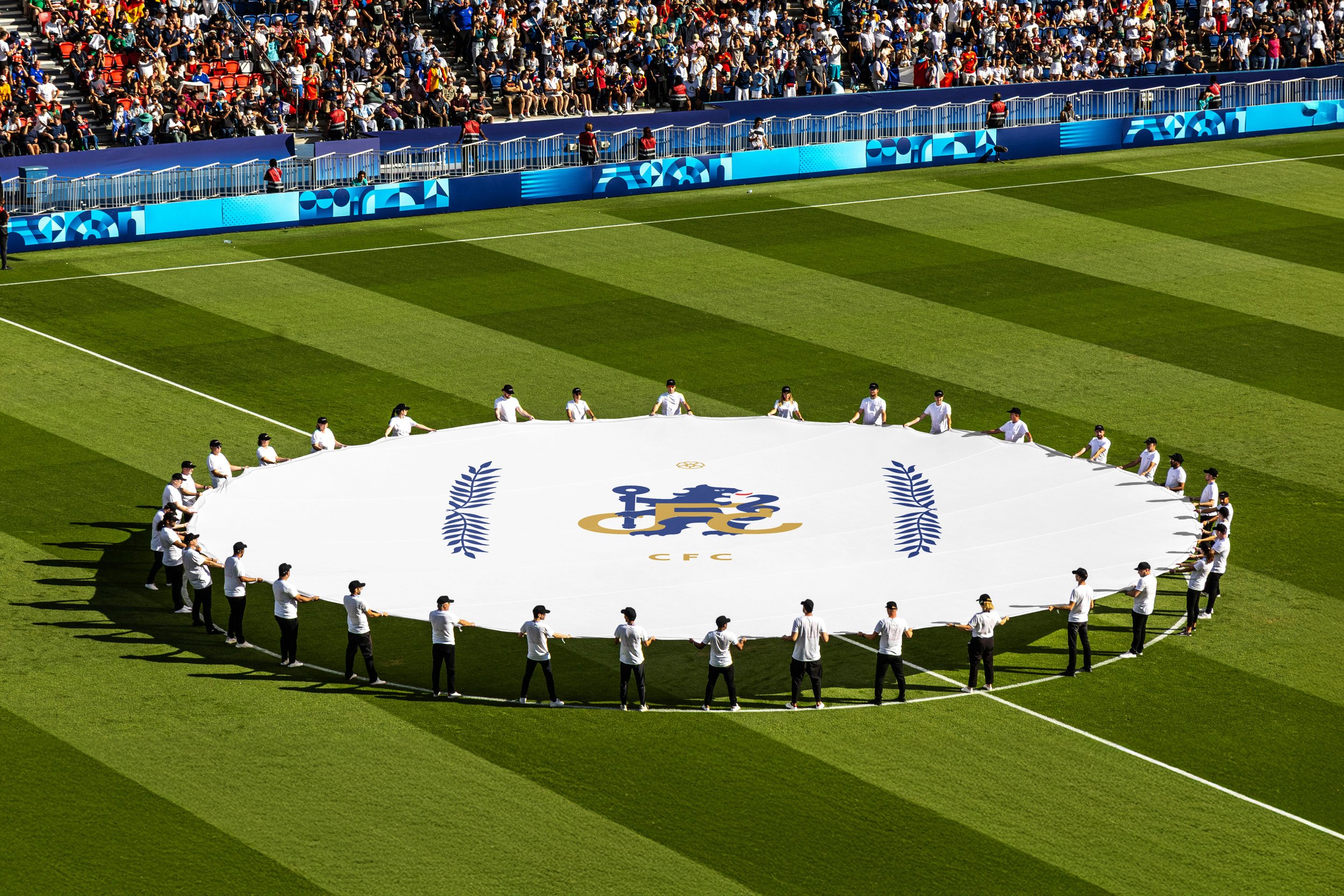
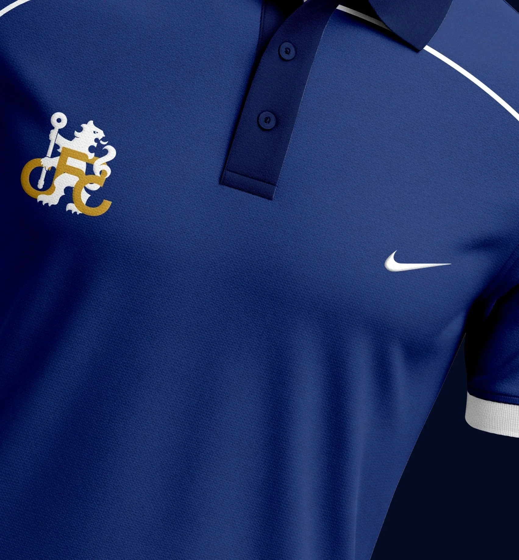
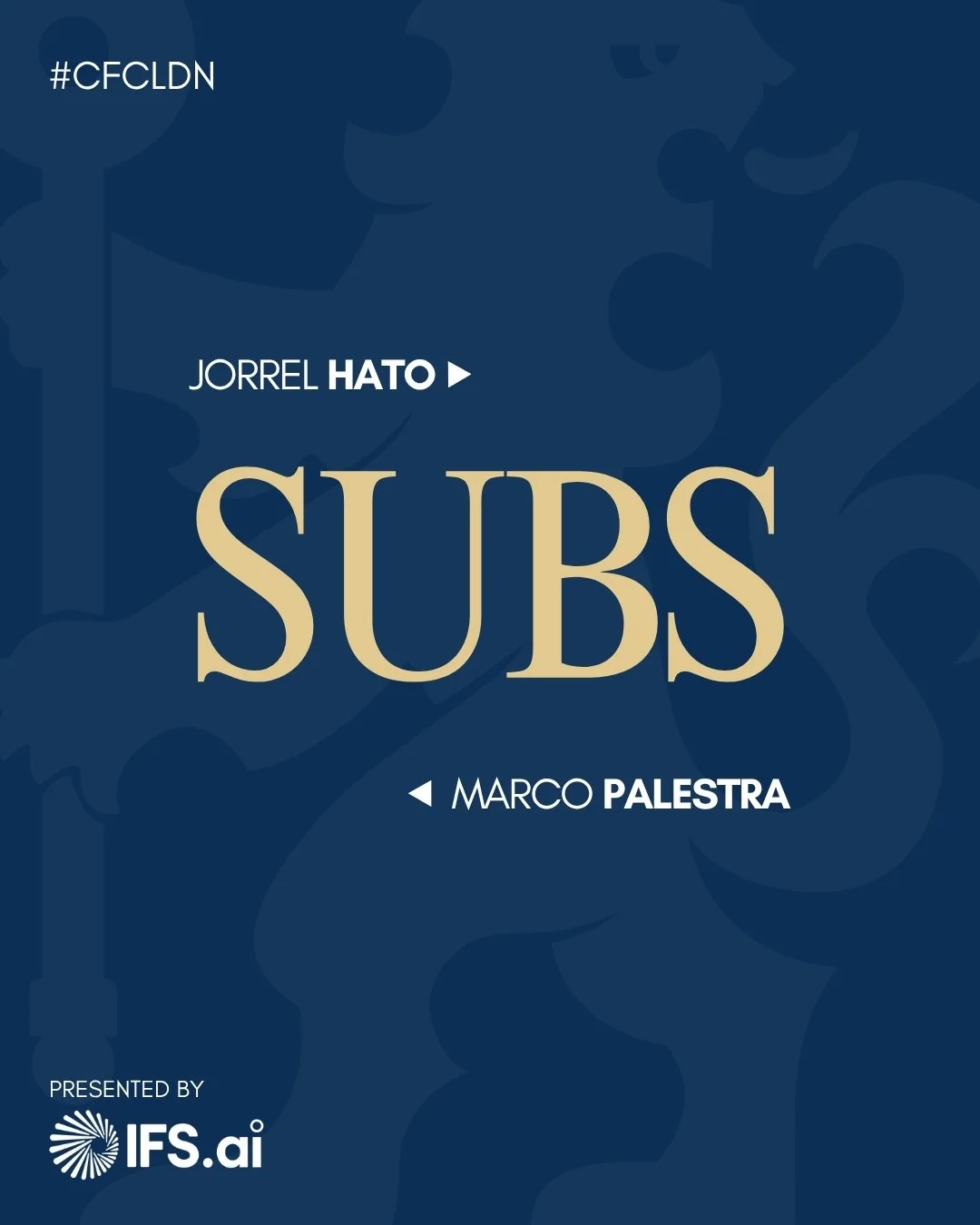
The new badge is a reflection of Chelsea Football Club’s transition into a modern era, while staying true to their roots. The famous Rampant Lion & Crozier shine brighter and more memorable than ever. Here to win, be brave, do the right thing, play our part, and most importantly, proud to be Chelsea. Chelsea are more than just a football club, it is a unity of ideas from every corner of the globe, coming together under one badge.
THE CLASSICS, BUT BOLDER.
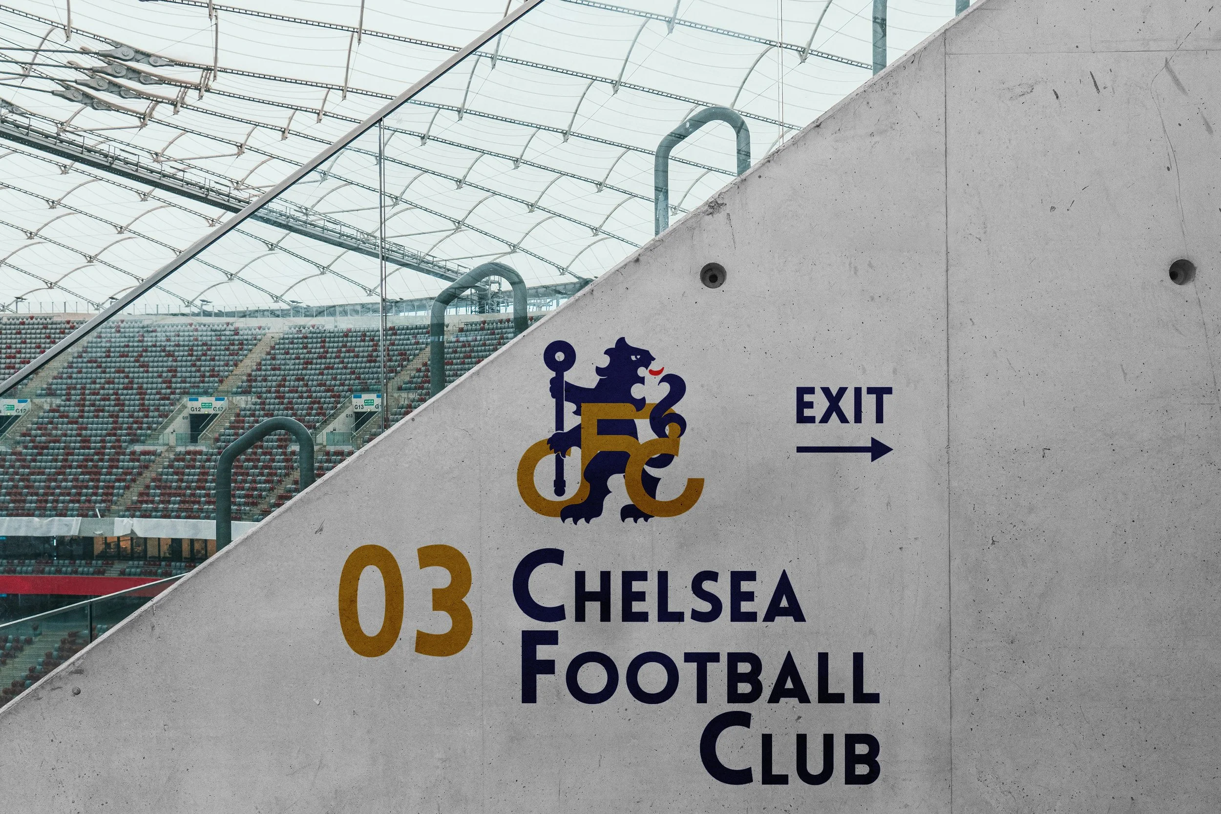
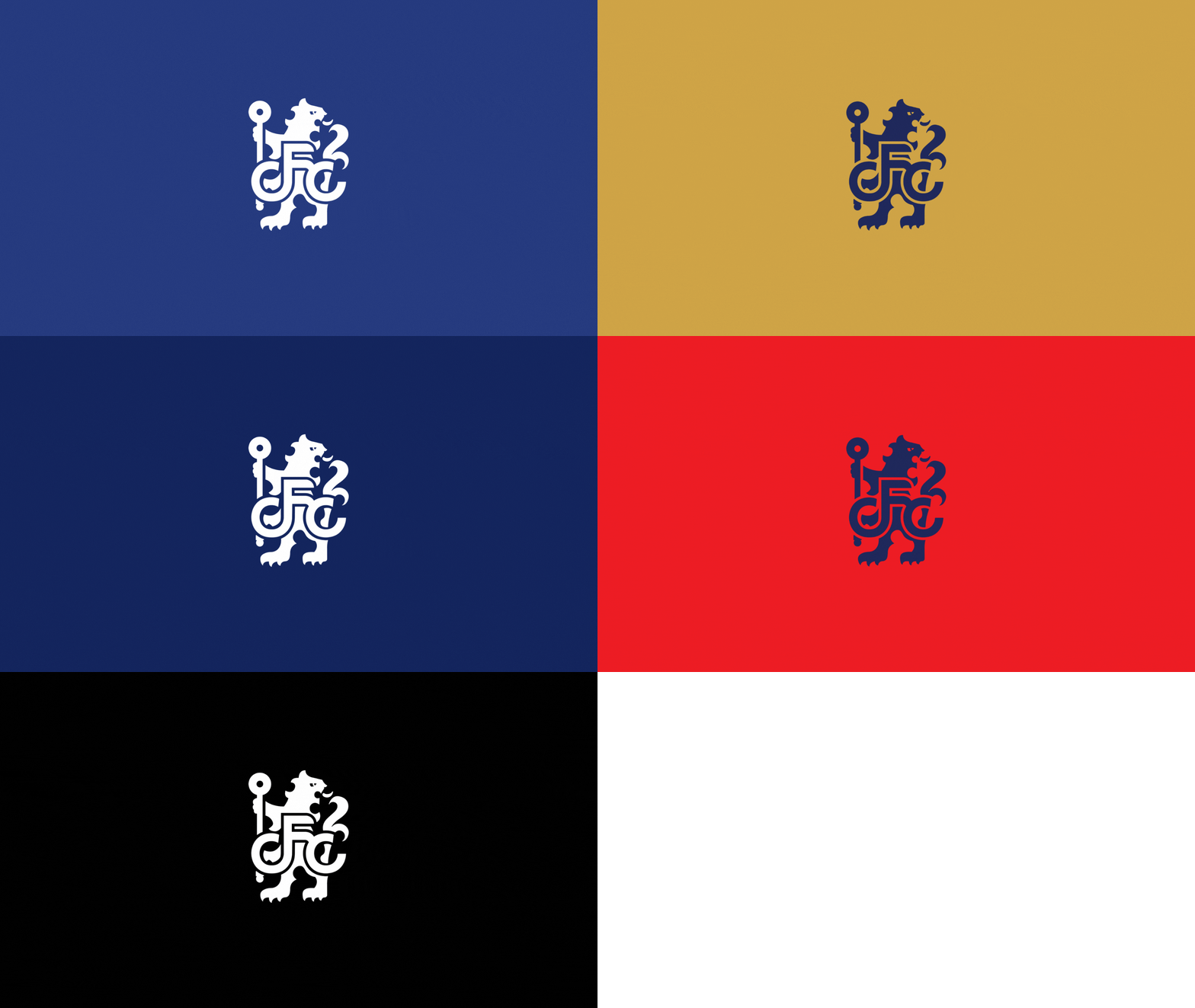
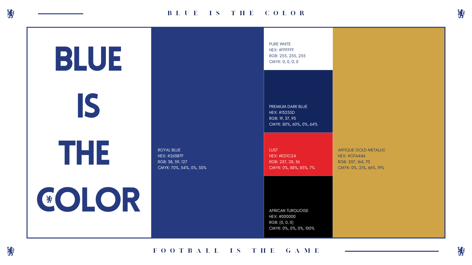
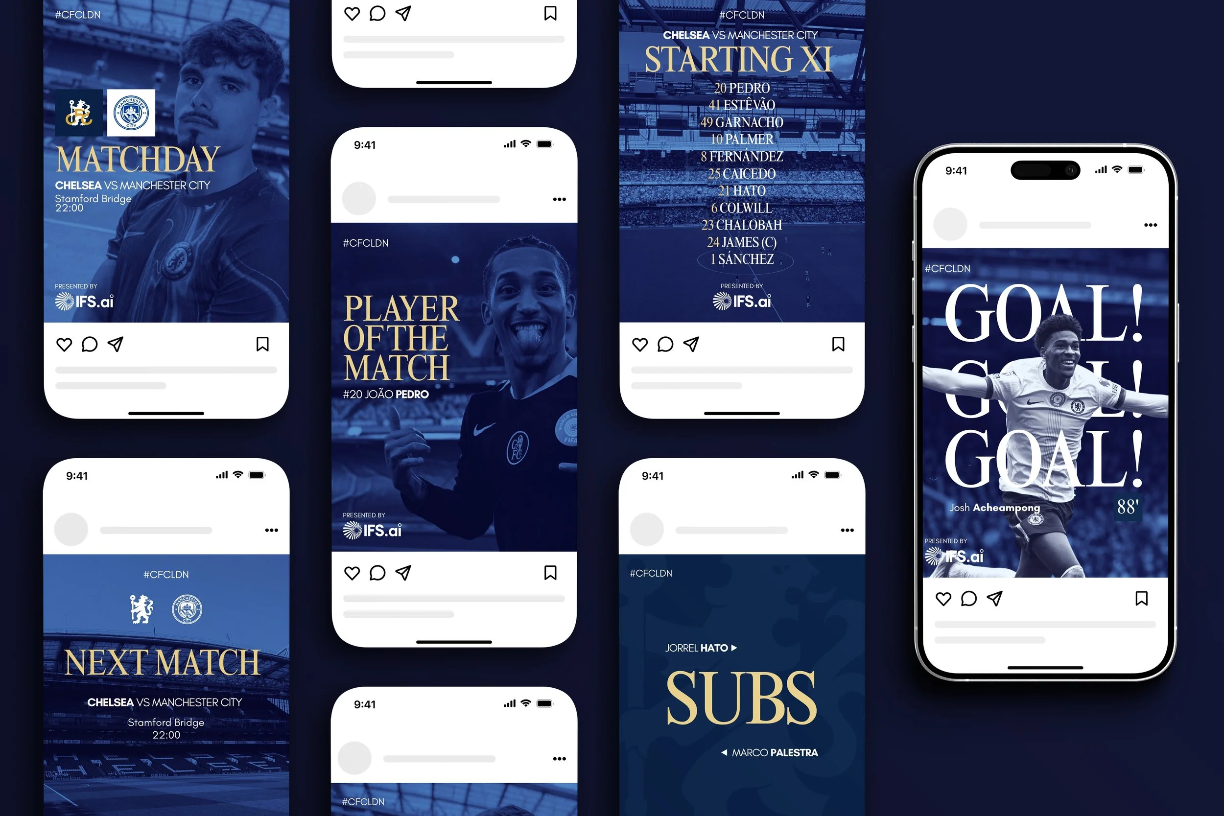
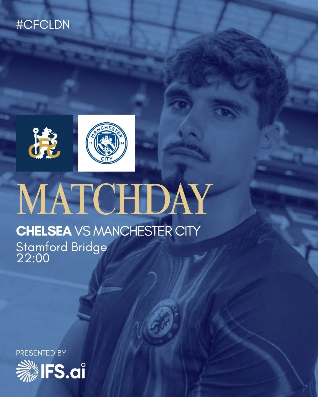
The classic Royal Blue is as present as ever, now rejuvenated by a complimentary, digital-first set of colors, injecting vibrancy into the brand. Bright, bold and unexpected, but still classy. This fresh new approach to colour signals a new era for the Chelsea visual identity.
A MODERN & ELEGANT PAIRING
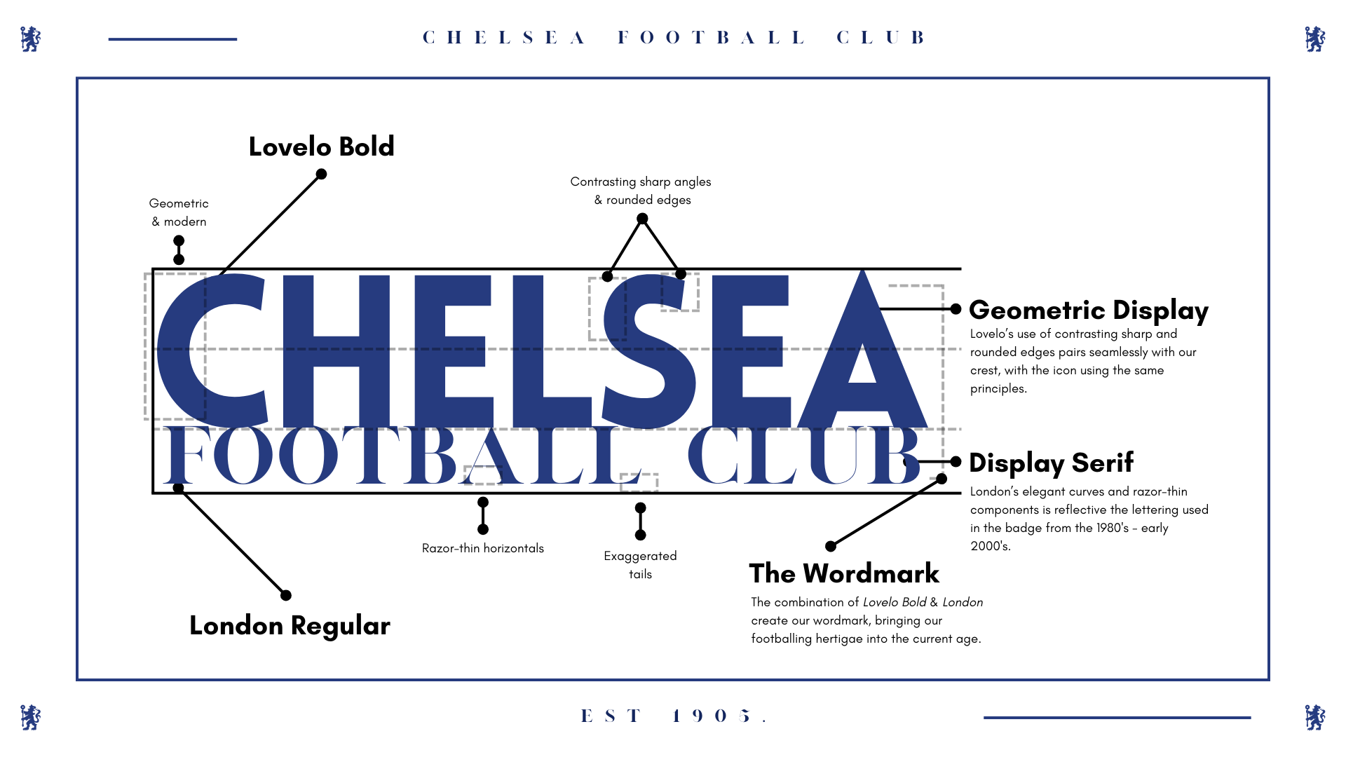
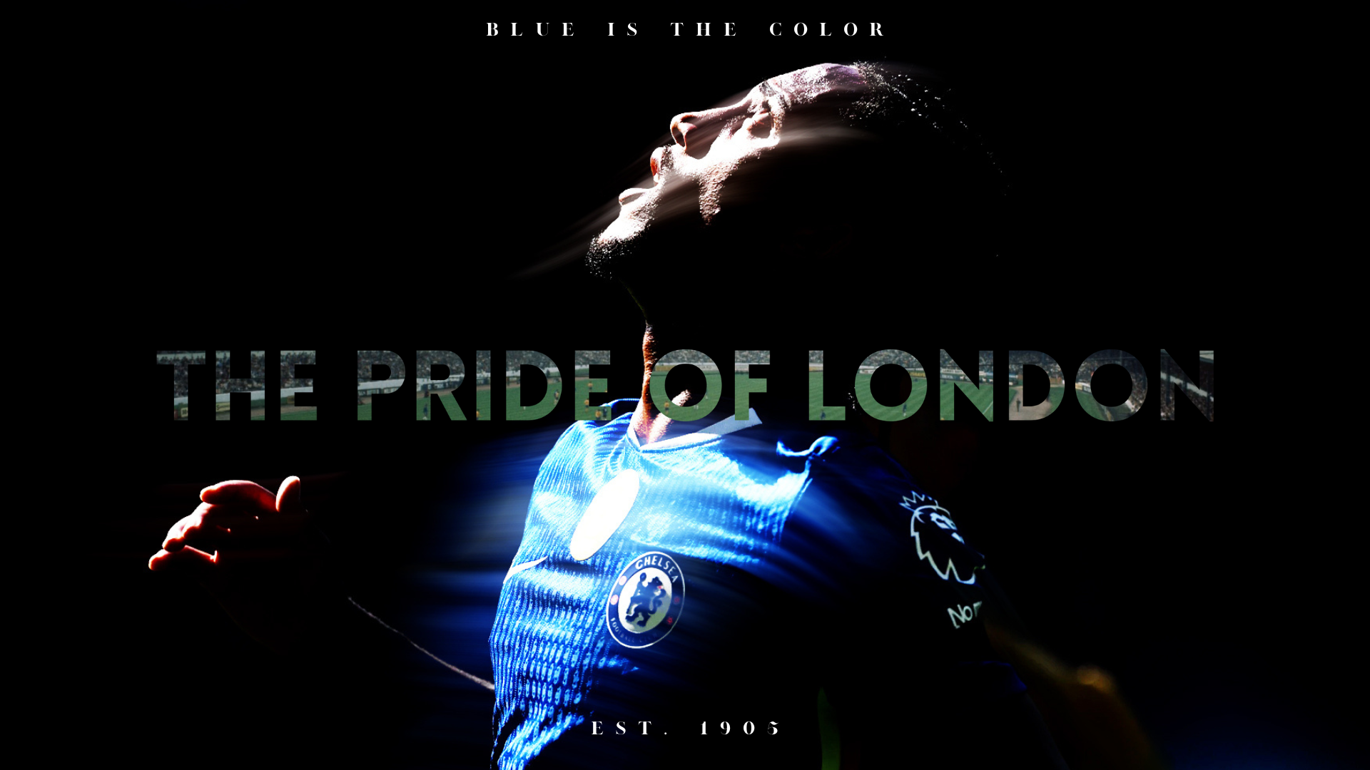
The new typeface for City is a geometric display typeface. Called Lovelo Bold, it is hardworking, full of character, bold and uncompromising whilst also being friendly. It is global, approachable, timeless, and proud to be Chelsea. The complimentary London Regular pays homage to the city, people, and history that the club is based in.

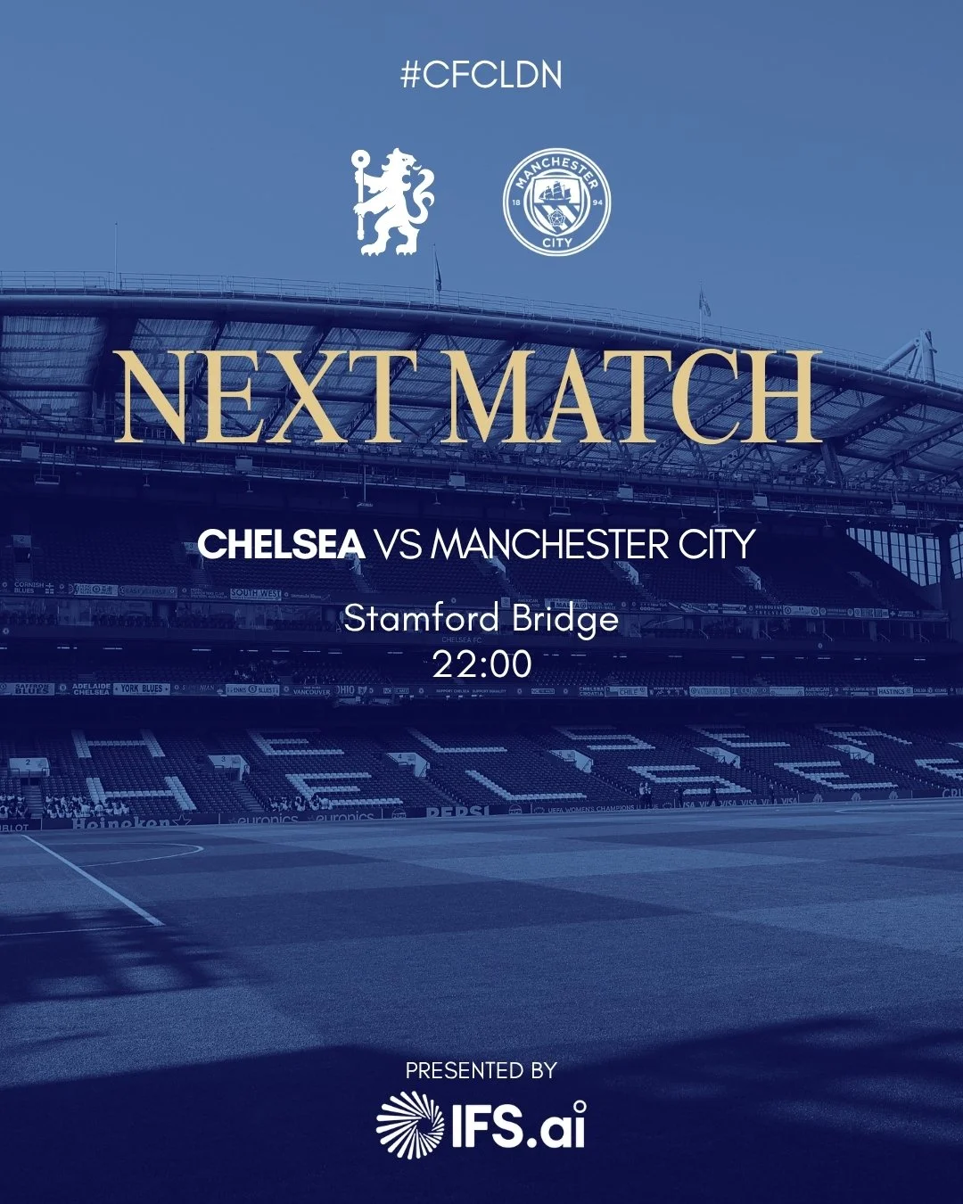

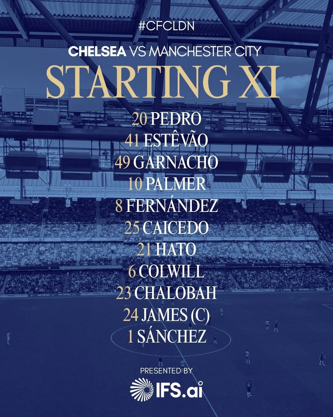
MORE THAN A LOGO
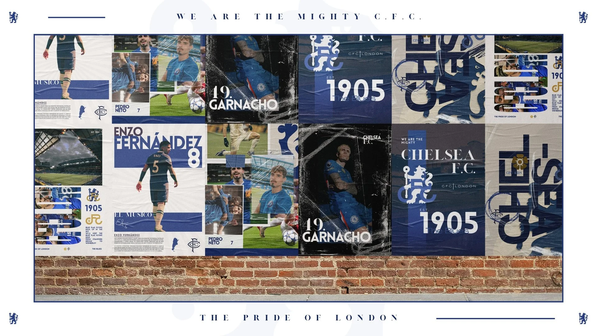
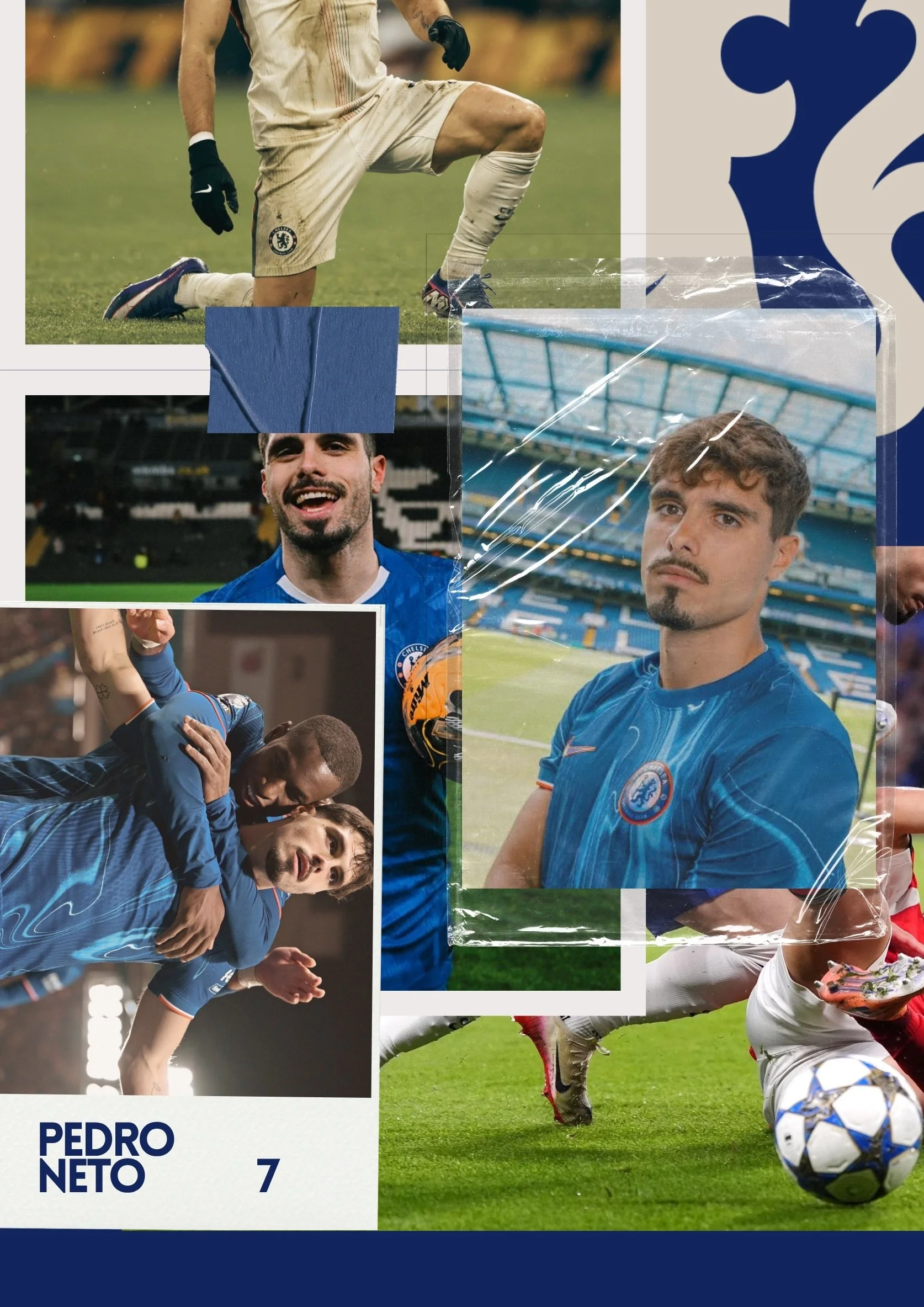
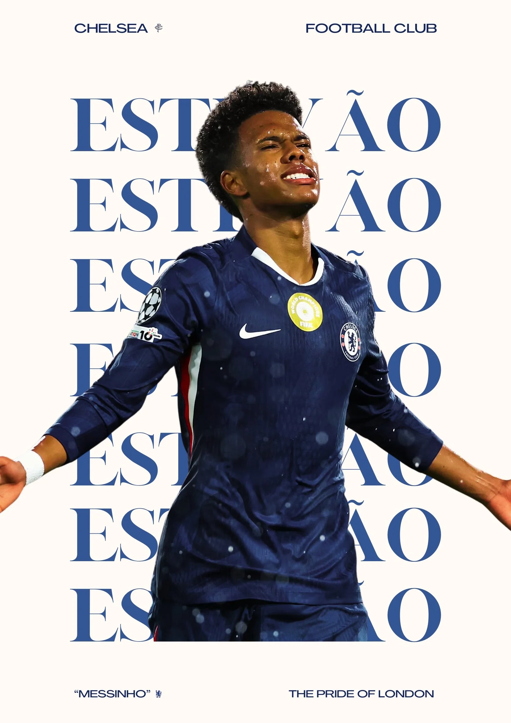
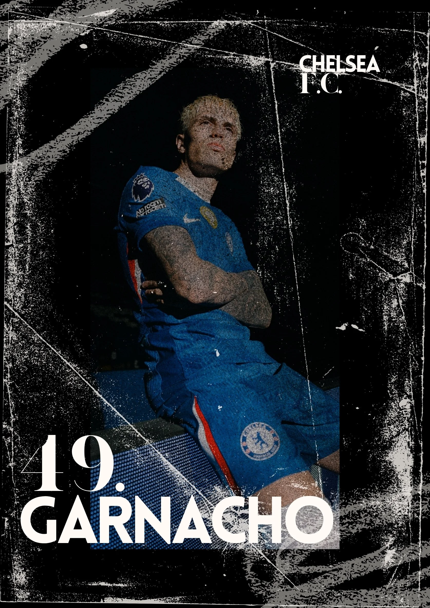
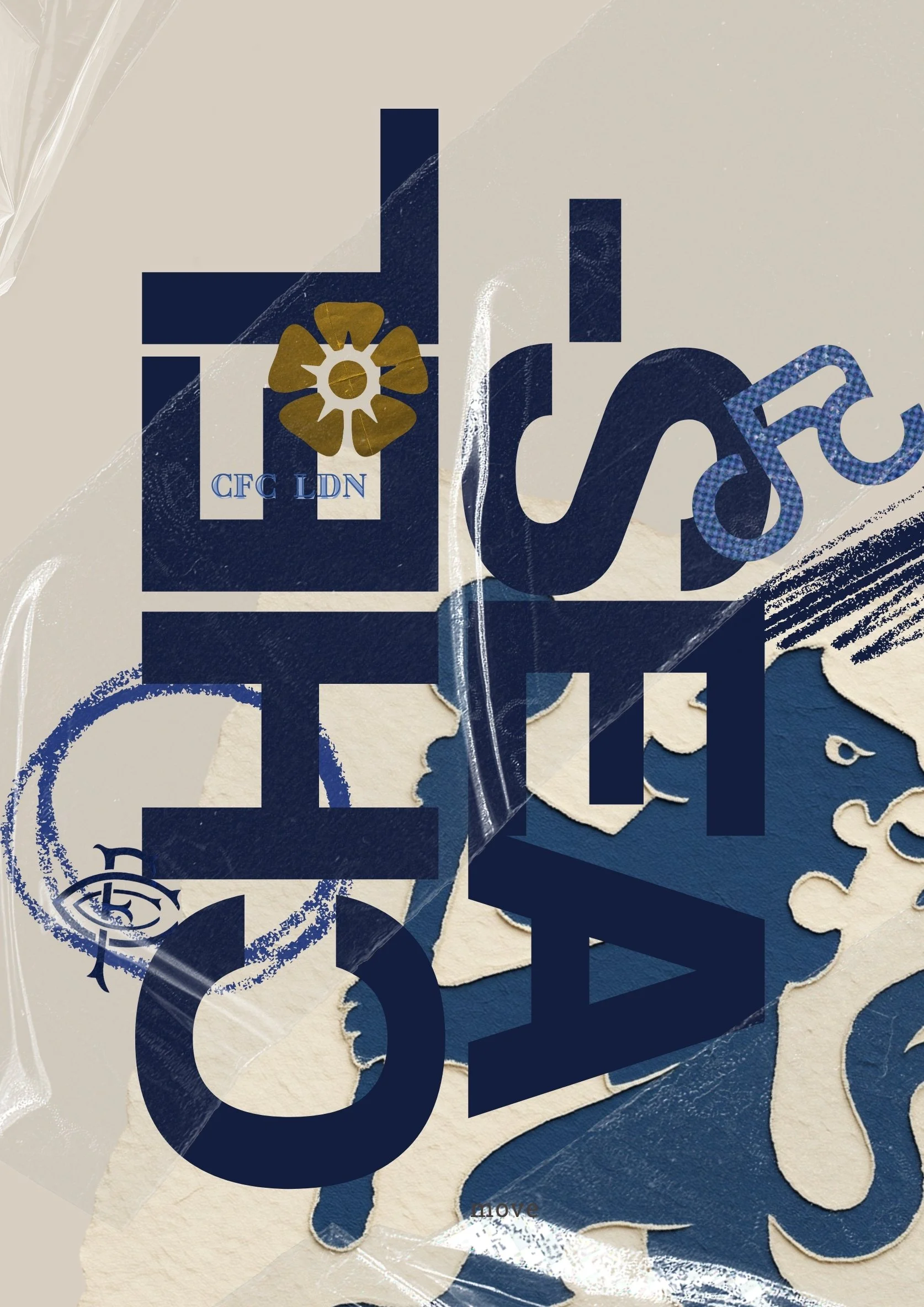
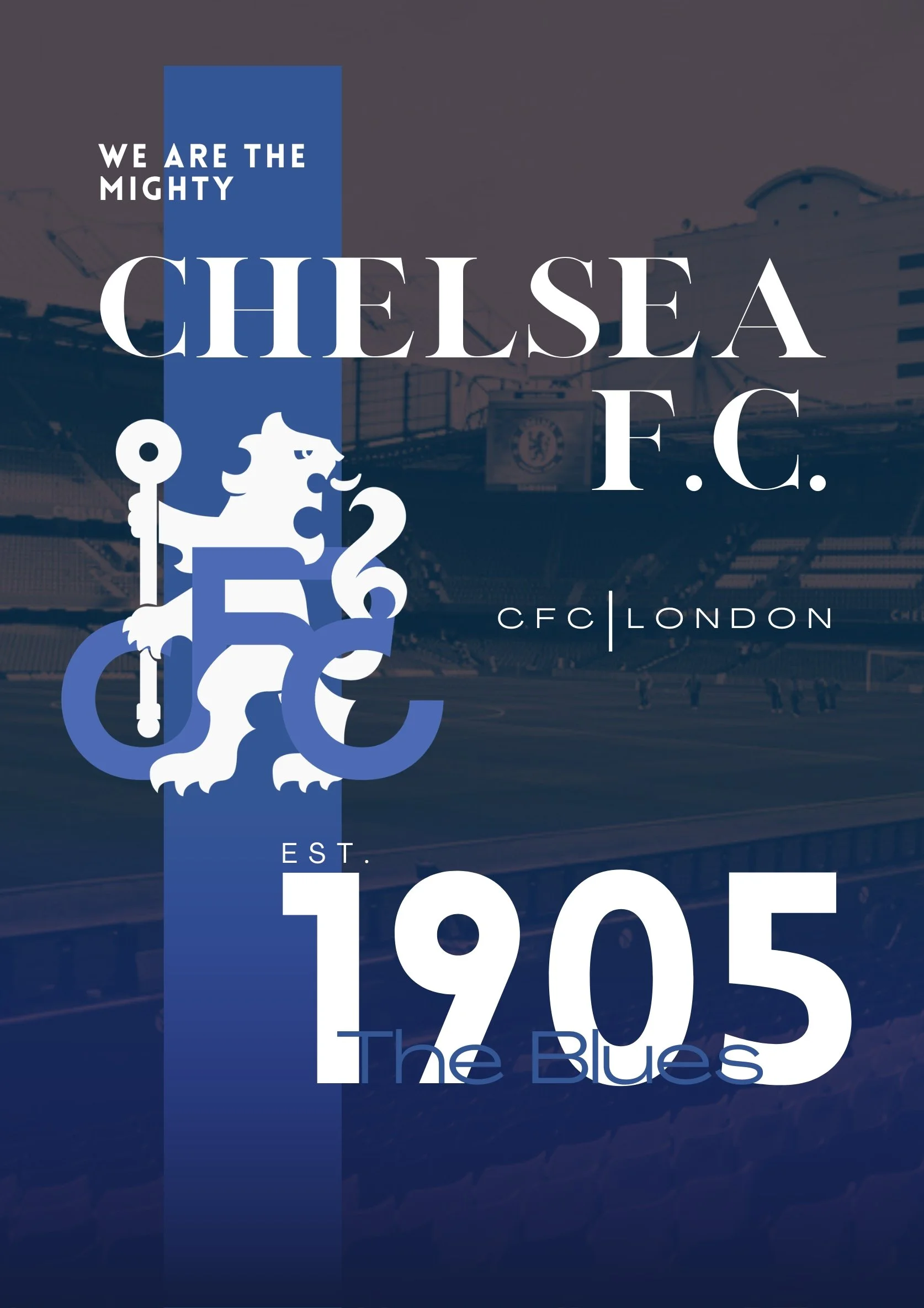
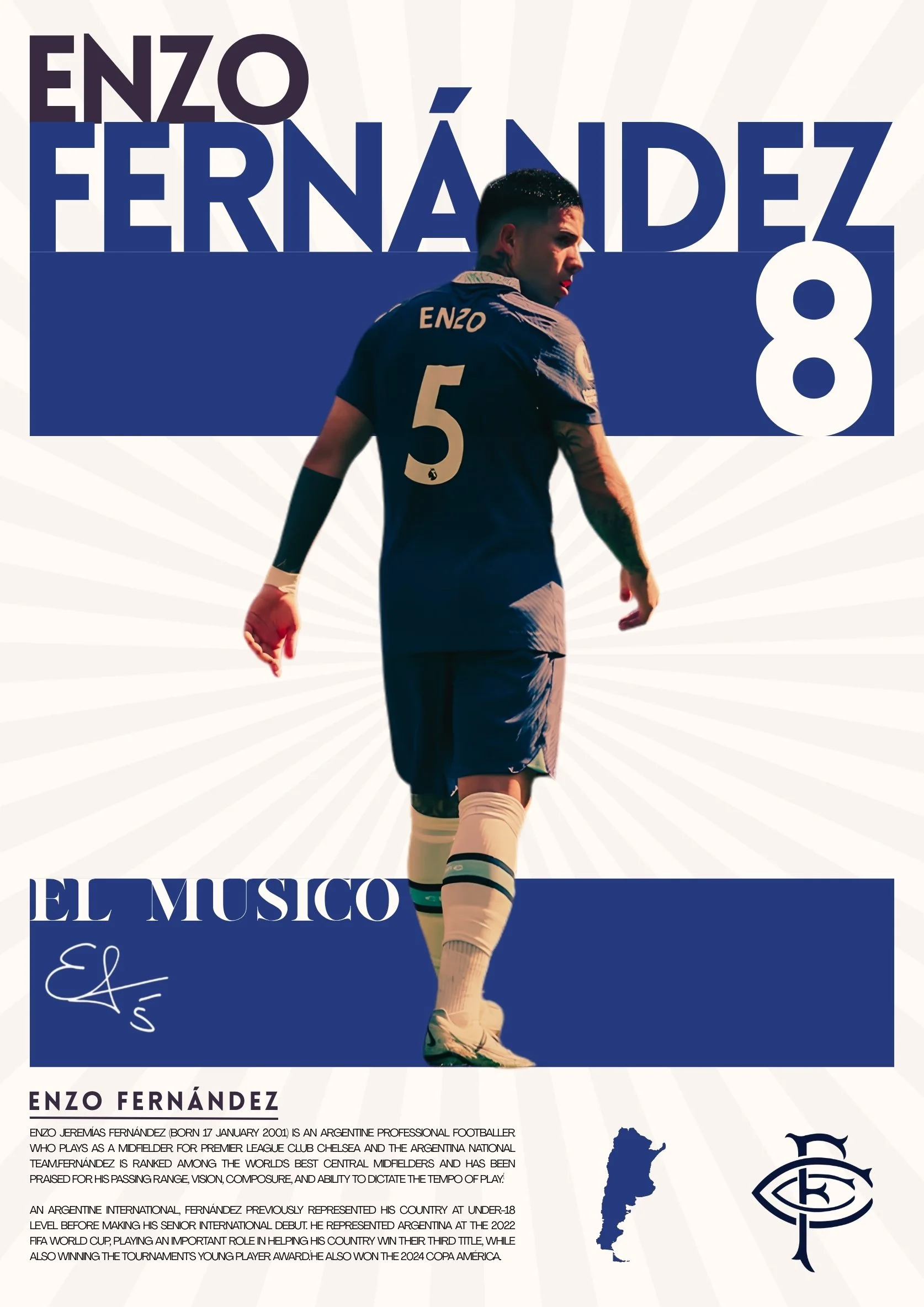
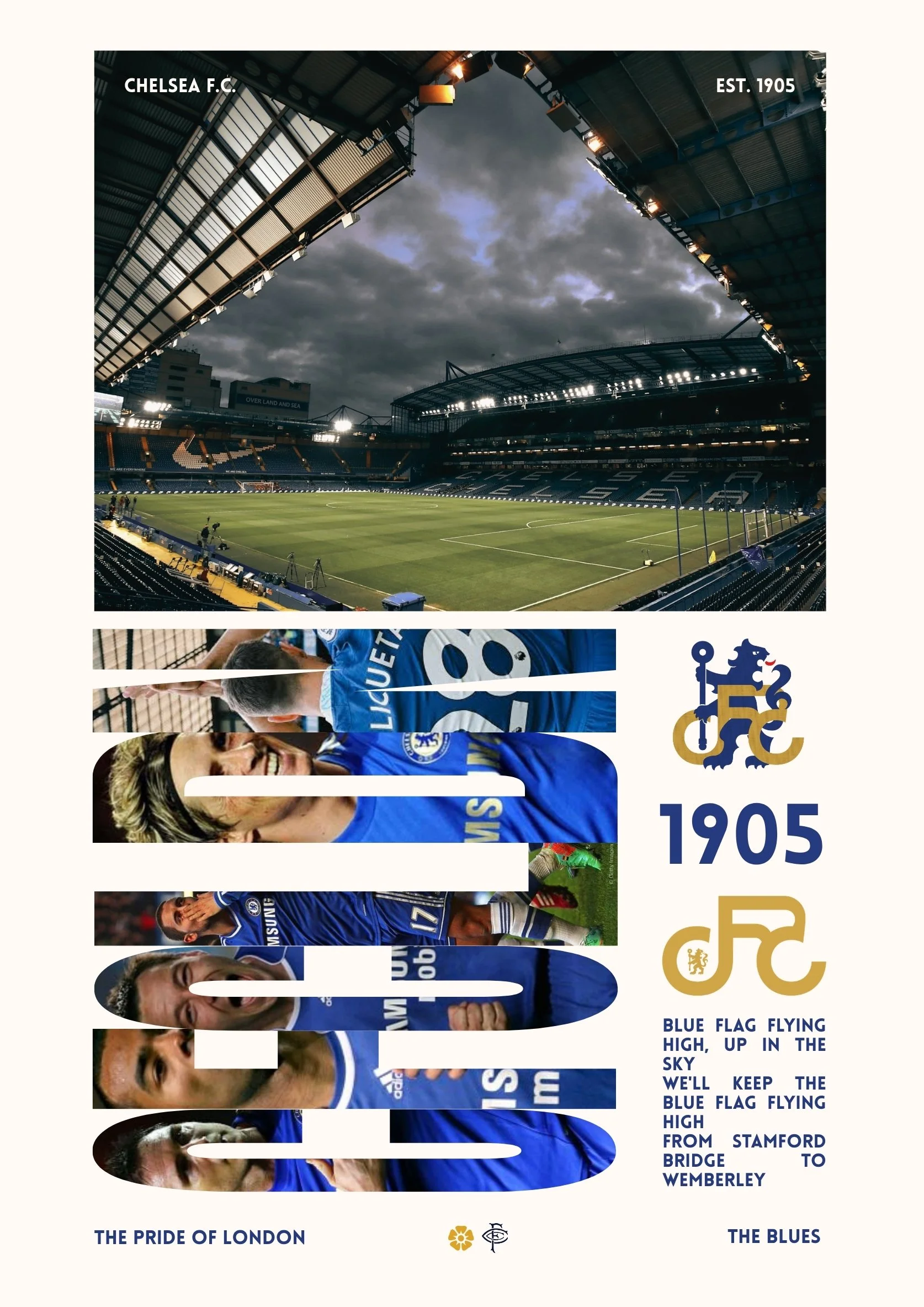
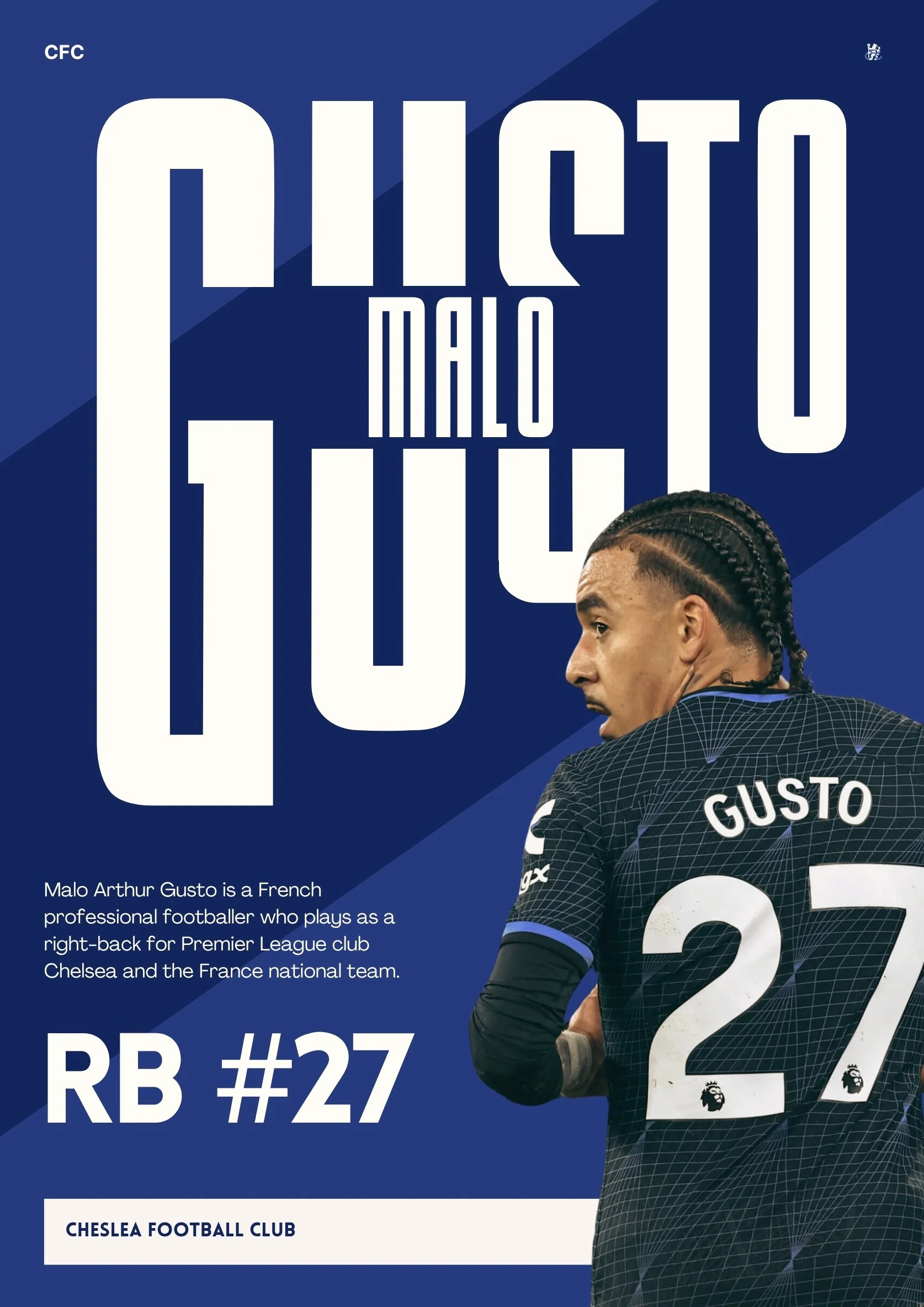
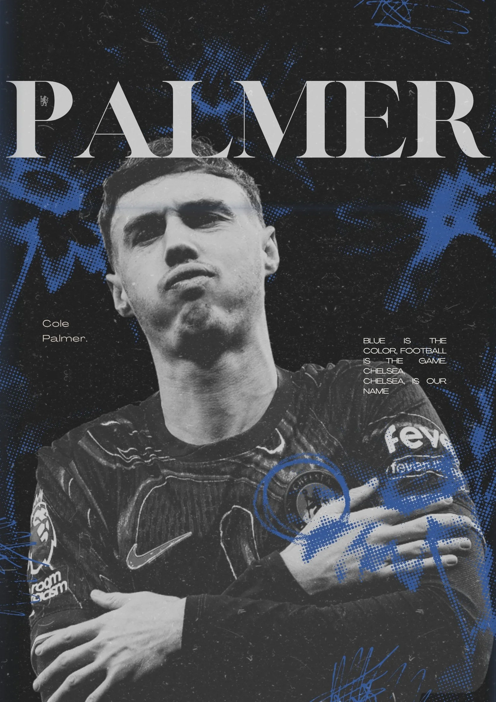
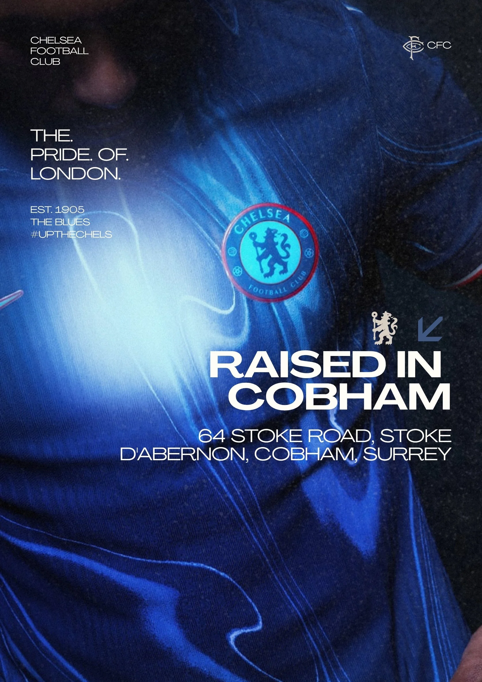
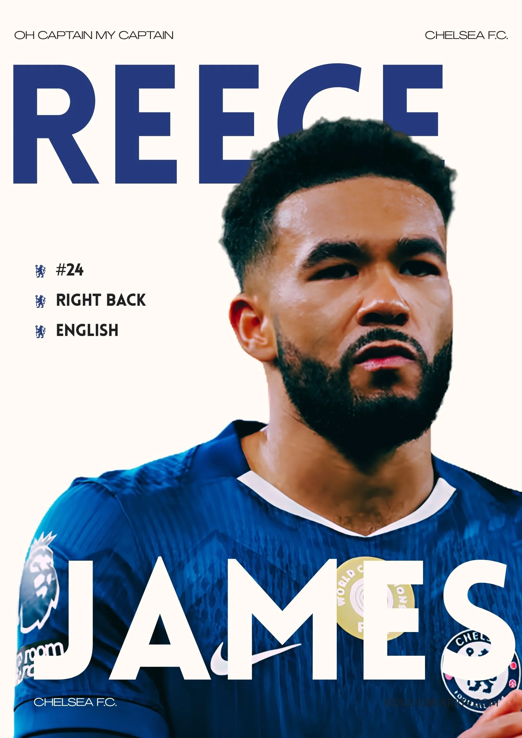
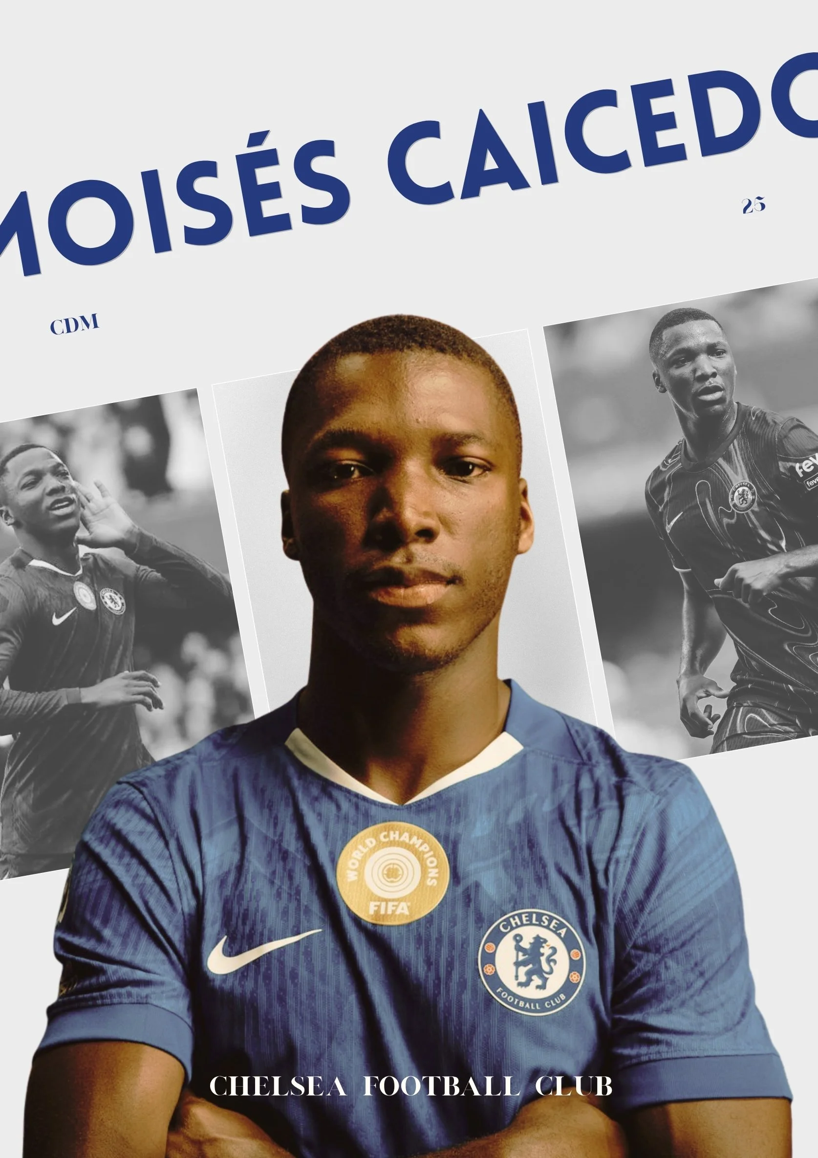
Notes From the Designer
This concept rebrand and visual identity is a self-initiated passion project for my favorite team in all of sport, Chelsea Football Club. The desire to complete this project stems from deeper then me being a fan of “the blues.”
In 2022, Chelsea fell under new ownership with BlueCo, an American owned company. Initially welcomed by fans, the relationship between the club owners and its supporters has become heavily strained. BlueCo takes a business first approach, which has directly caused the teams success to fall. The fans value their clubs heritage, being hesitant to accept change as football moves into a modern, more commericalized era.
My goal for this rebrand was to please both parties, creating a badge that represents Chelsea as a marketable brand, while still honoring the clubs roots.
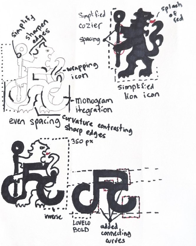
The Rampant Lion and Cozier, a symbol for the club since the early 2000’s is still the focus of the club’s identity, but has now been removed from dated crest, simplified, and presented as its own icon. I then made the choice to bring in the bold lettering from the old crest, but choosing a more geometric font, settling on Lovelo. Adding some personal elements lead to the creation of the “CFC” monogram that layers in front of the lion.