
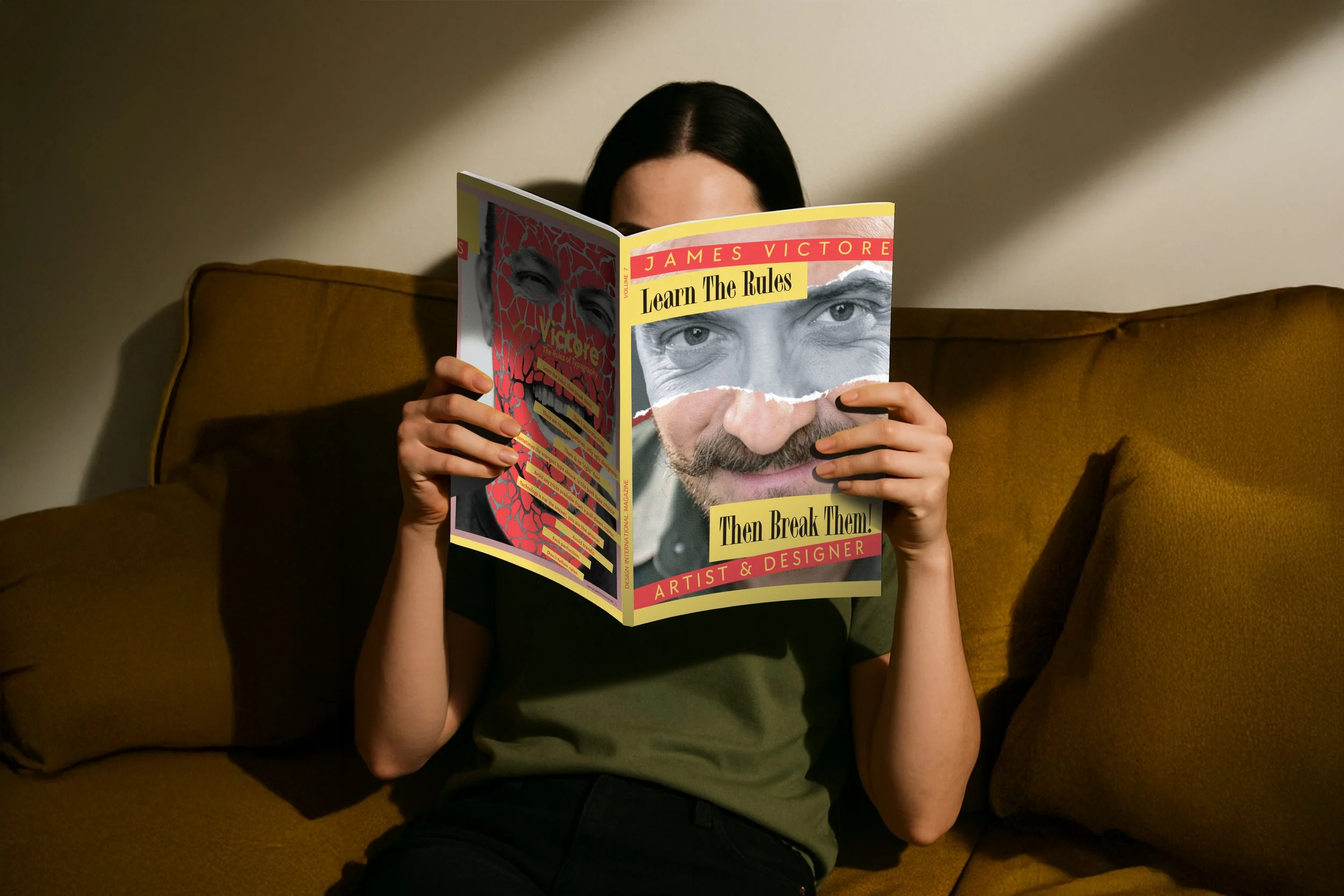
DESIGN INTERNATIONAL - A JAMES VICTORE DEEP DIVE
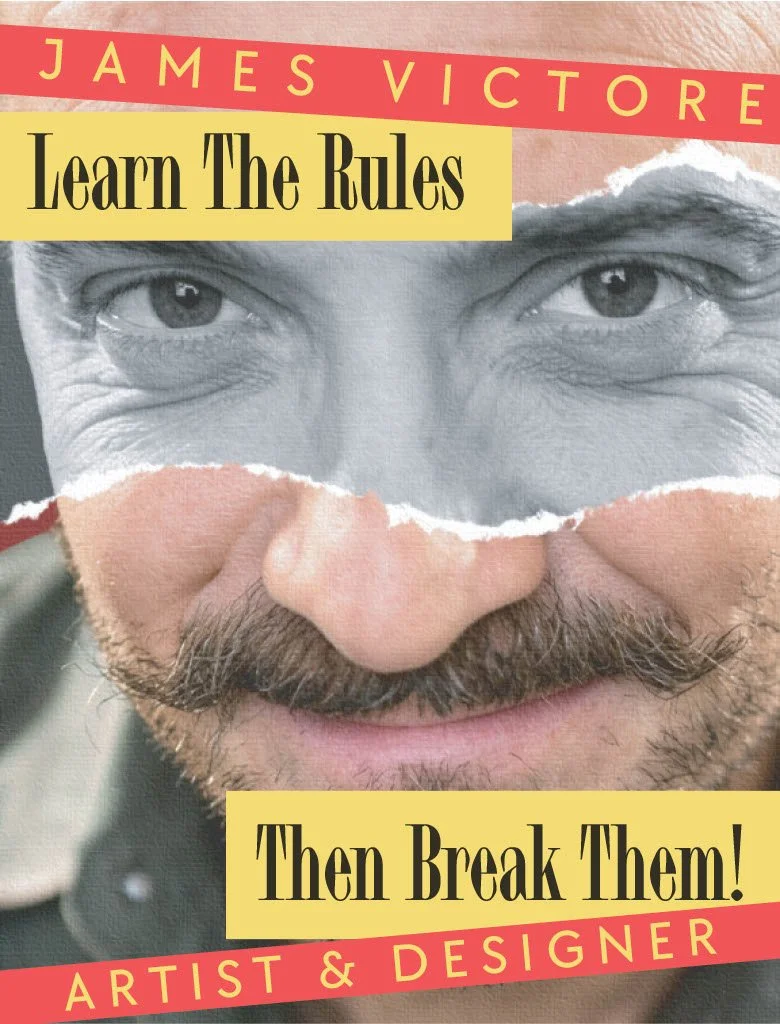
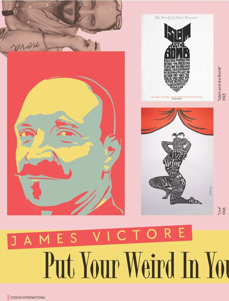
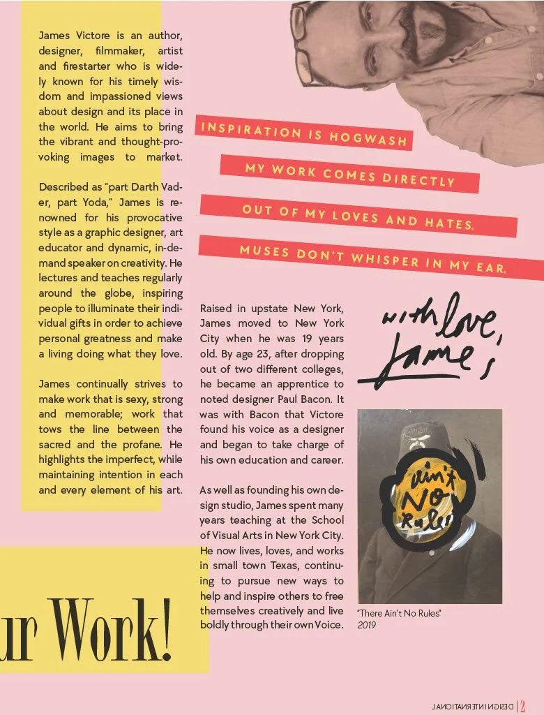
Hats Worn: Art Director, Illustrator, Graphic Designer, Photo Editor
Year: 2026
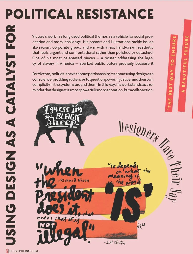
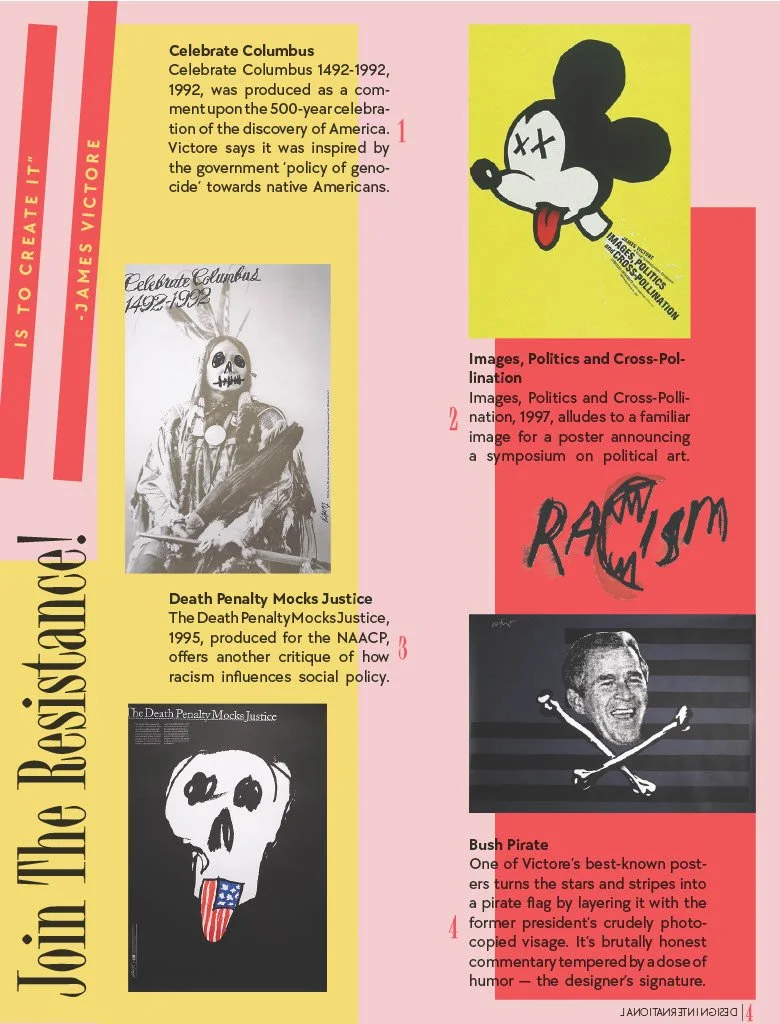
Victore’s motto of “feck perfuction,” is the perfect descriptor of his work. It is unconventional, rule-breaking, and unapologetic, which is what makes it so memorable. Victore isn’t afraid to speak his mind through design, with much of his work surrounding the political landscape, calling out the issues of our society. He doesn’t design to match an aesthetic, but to spread a message, and in doing such, has developed a style of work that is distinctly Victore.
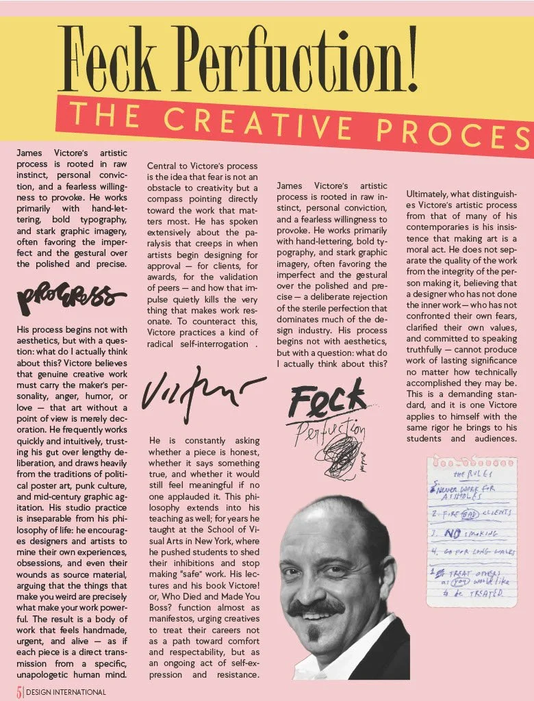
This self-initiated project is a conceptual magazine article studying the life, work, and mindset of designer James Victore, a personal inspiration.
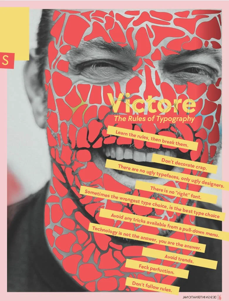
The real challenge of this article was finding a way to display Victore’s work, while still maintaining my own visual style. While the content may be the work of another, the design is Otto Lukanic. My approach to design brings structure into Victore’s chaos. Instead of learning the rules of design to purposefully oppose them, I alter, expand, and experiment with these principles.
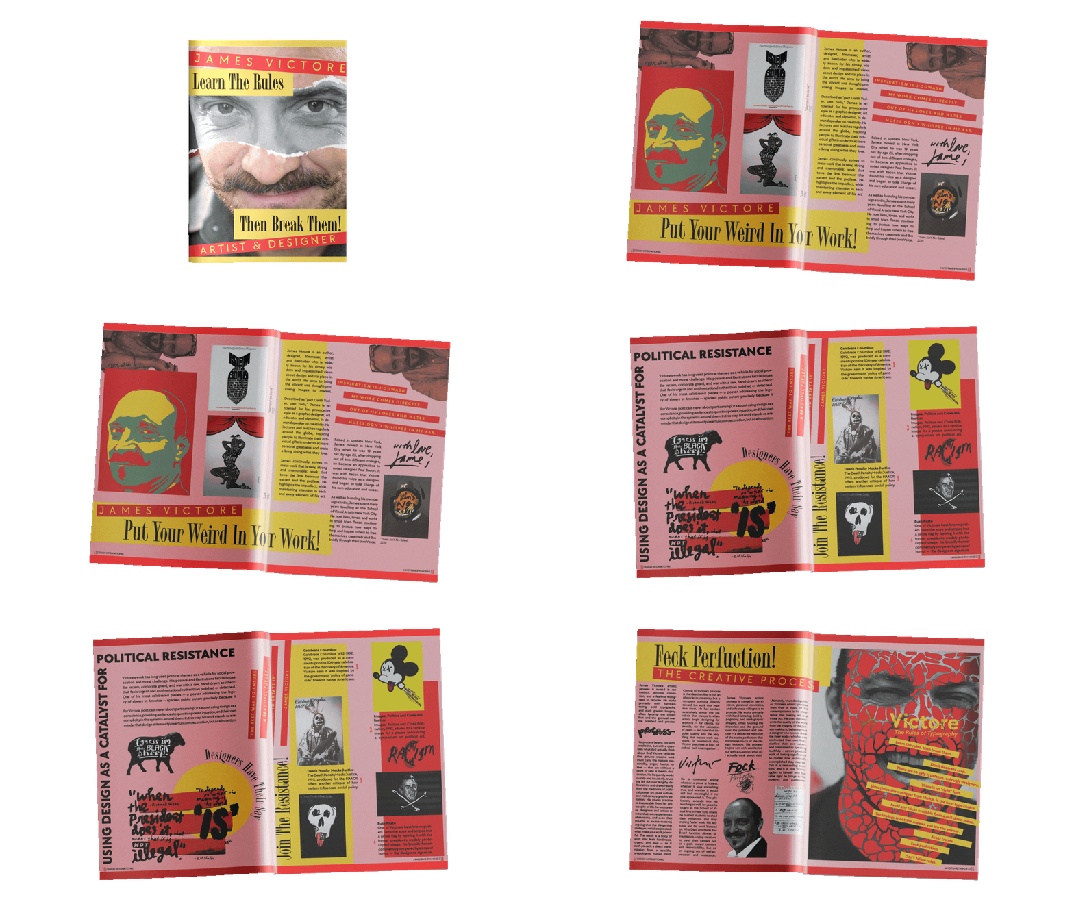
The layout itself is based on two seperate grid systems. One for visual elements and one for type. When the two grids are laid on top of each other, a balanced offset is created.
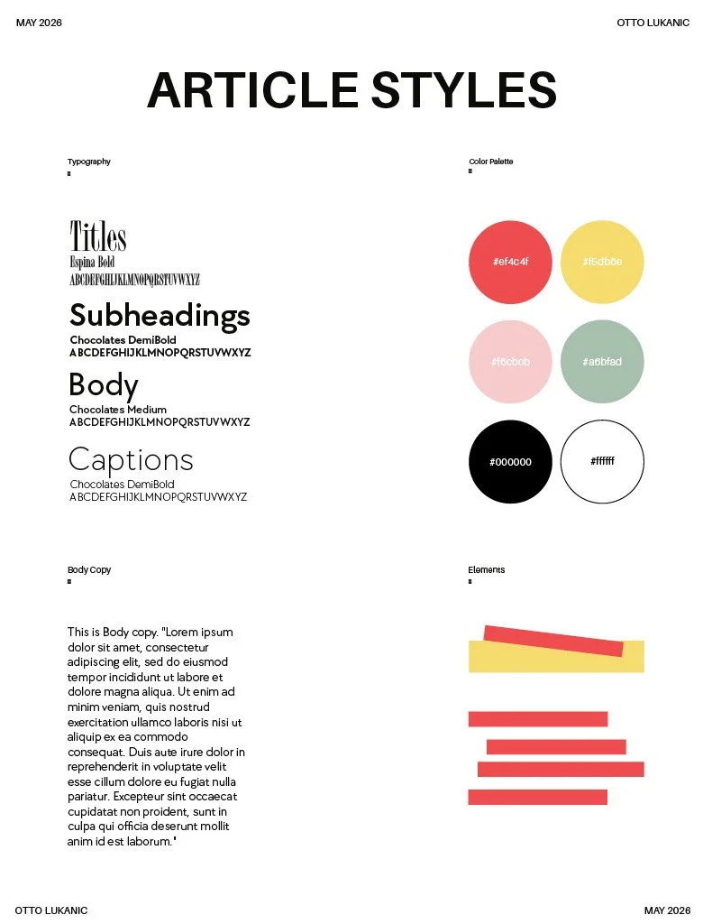
Article Style Sheet
Consistent throughtout the article are two typefacs, TT Espina and TT Chocolates. Both created by TypeType Foundry, they couldn’t be more stylistically different. Espina is an eye catching serif, making it perfect for leading the reader to large titles or important messaging. Chocolates, on the other hand, is a balanced, visually pleasing sans-serif. The unexpected pairing contrast each other, but this leads to a balance. Espina screams boldly, then Chocaltes counteracts with its friendly humanistic approach.
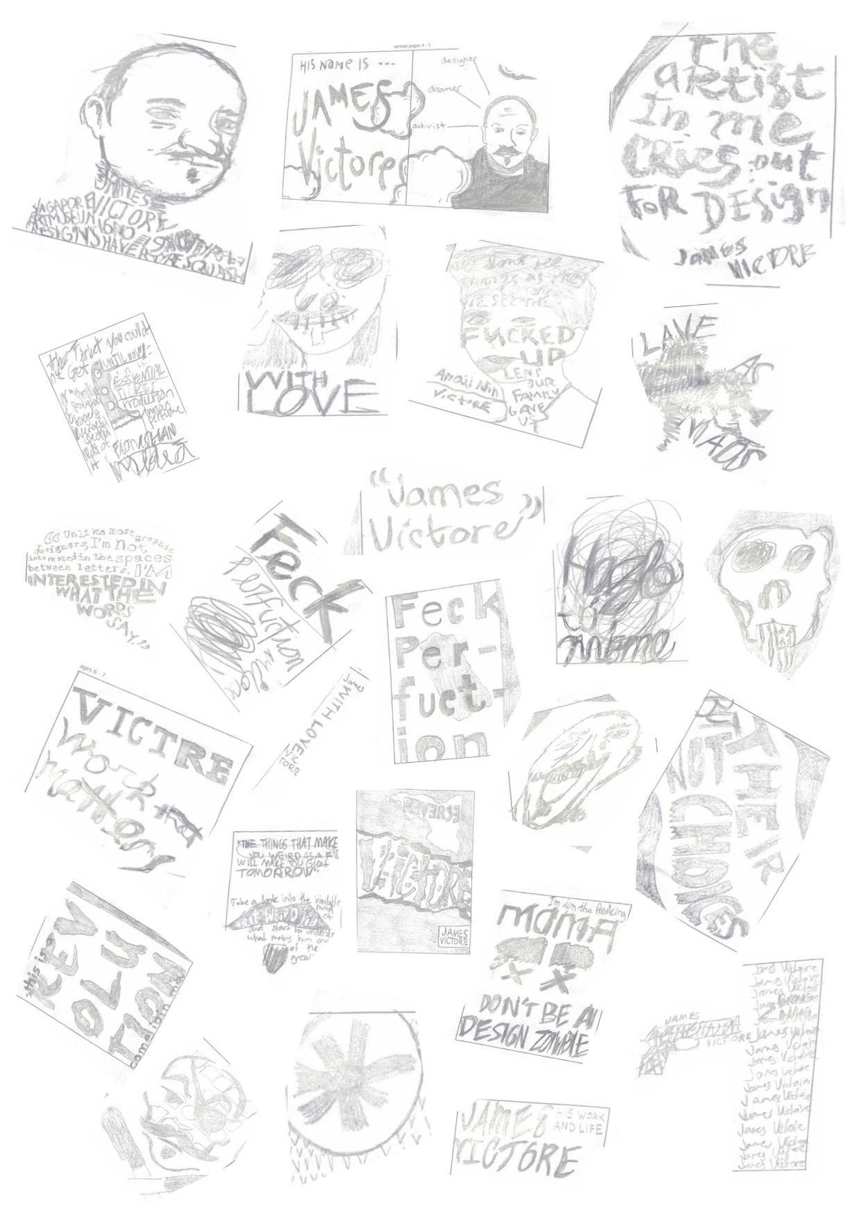
Concept Sketches