Typeface Specimen
- A Deep Dive Into Tenez
Hats Worn: Art Director, Graphic Designer, Illustrator, Copywriter
Year: 2025
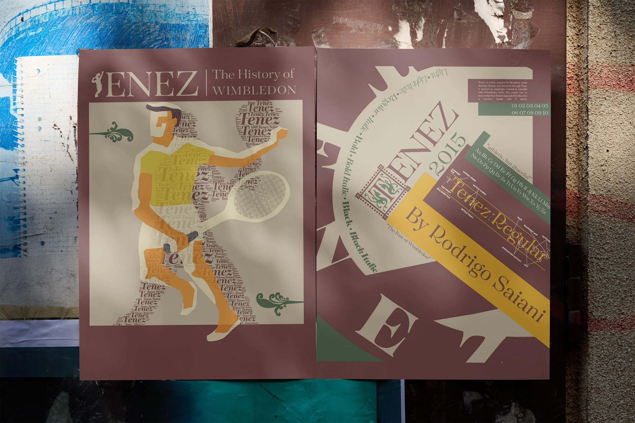
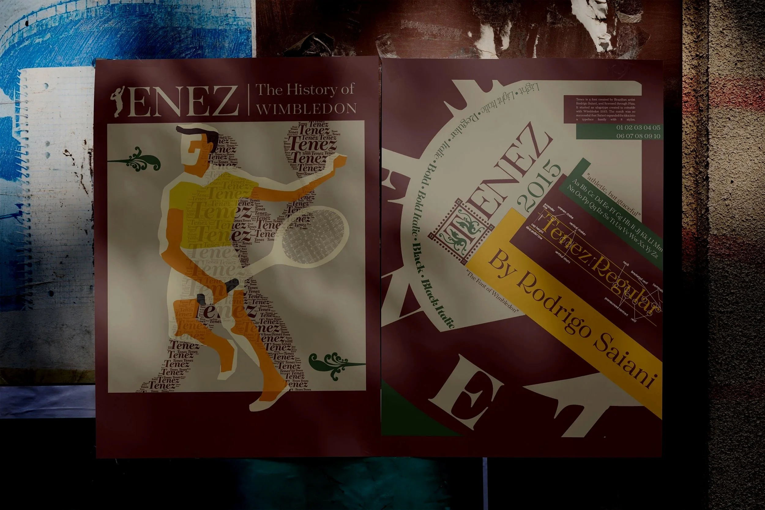
This self-initiated project is a typeface specimen set that examines Tenez, one of my personal favorites.
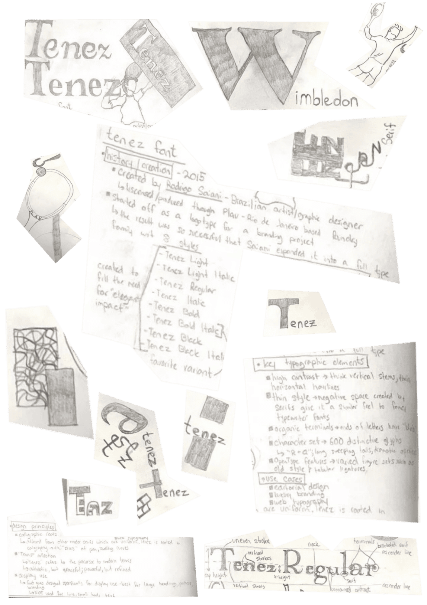
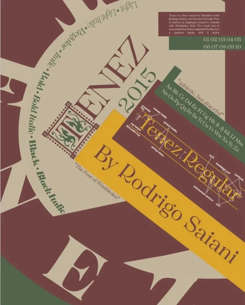
Created by Rodrigo Saiani in 2015, Tenez started out as a logotype for a branding project. The result was so succesful that Saiani expanded the project into a full type family, with eight distinct styles.
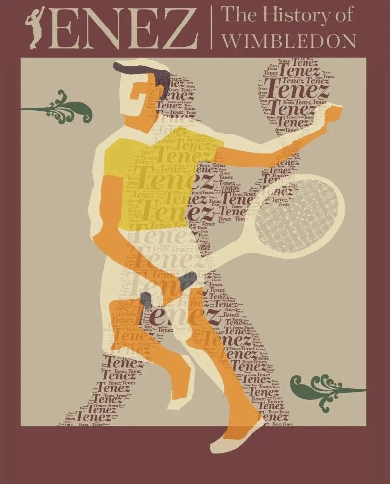
Tenez’s Creation coincided with the 2015 Wimbledon Championships, capturing the essence of the sport through its design. Tenez is the pinnacle of elegence, while maintaining it organic roots. The typeface is characterized by think vertical stems juxtaposing hairline vertical strokes. This interaction creates a negative space, which is occupied by fancy serifs, giving Tenez a similar feel to old-fashioned typewriter fonts. The character set consists of 600 distinctive glyphs, with the most notable being dramatic tails in the “R” and “a.”
Tenez’s intended use is as a display font, being featured in editorial design, luxury branding, and web typography.
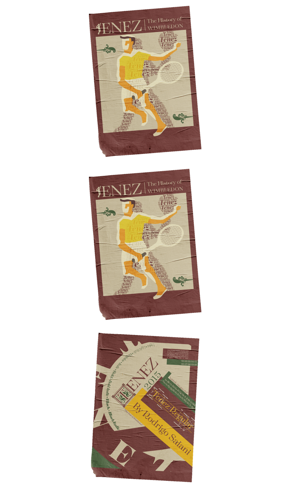
The design focuses on implementing abstract elements into design without taking away from the focus the font. There is a fine line between implementation and overwhelming, and it is the goal of every graphic designer to establish where that line is.
Highlighting Tenez is a classy and sophistiacted theming, utilizing minimal geometric shapes in the background. The theming is a call of Tenez’s origins in classic tennis, with the muted colors giving an elegant feel.
The final result is reflective of a series of revisions, experimenting with differnt way of displaying the font, along with the story behind it.