solarcycle
- a social media campaign
Social media campaign for Solarcycle’s mission to improve online media presence. The strategic design and content approach targeted LinkedIn with a following of 14,000 and Instagram to drive more consistent audience growth.
Challenge: Solarcycle needed a cohesive visual system for their online platforms that would project solar recycling innovation while remaining strictly within established, minimalist brand parameters: a vibrant orange palette, subtle gradients, and simple geometric typography, utilizing minimal standalone visuals.
Year: 2026
Client: Solarcycle is an Arizona based company that provides an affordable, eco-friendly process to recycle solar panels and repurpose the materials for new uses.
They partner with the nation’s leading solar companies to recycle their solar systems and build a circular solar economy.
Solarcycle’s Social Media Campagin
Hats Worn:
Visual Strategist – Translated brand constraints, environmental data, and company PR into dynamic graphic concepts.
Template Architect – Designed a scalable, modular interface system for repeatable corporate asset creation.
Visual Strategy
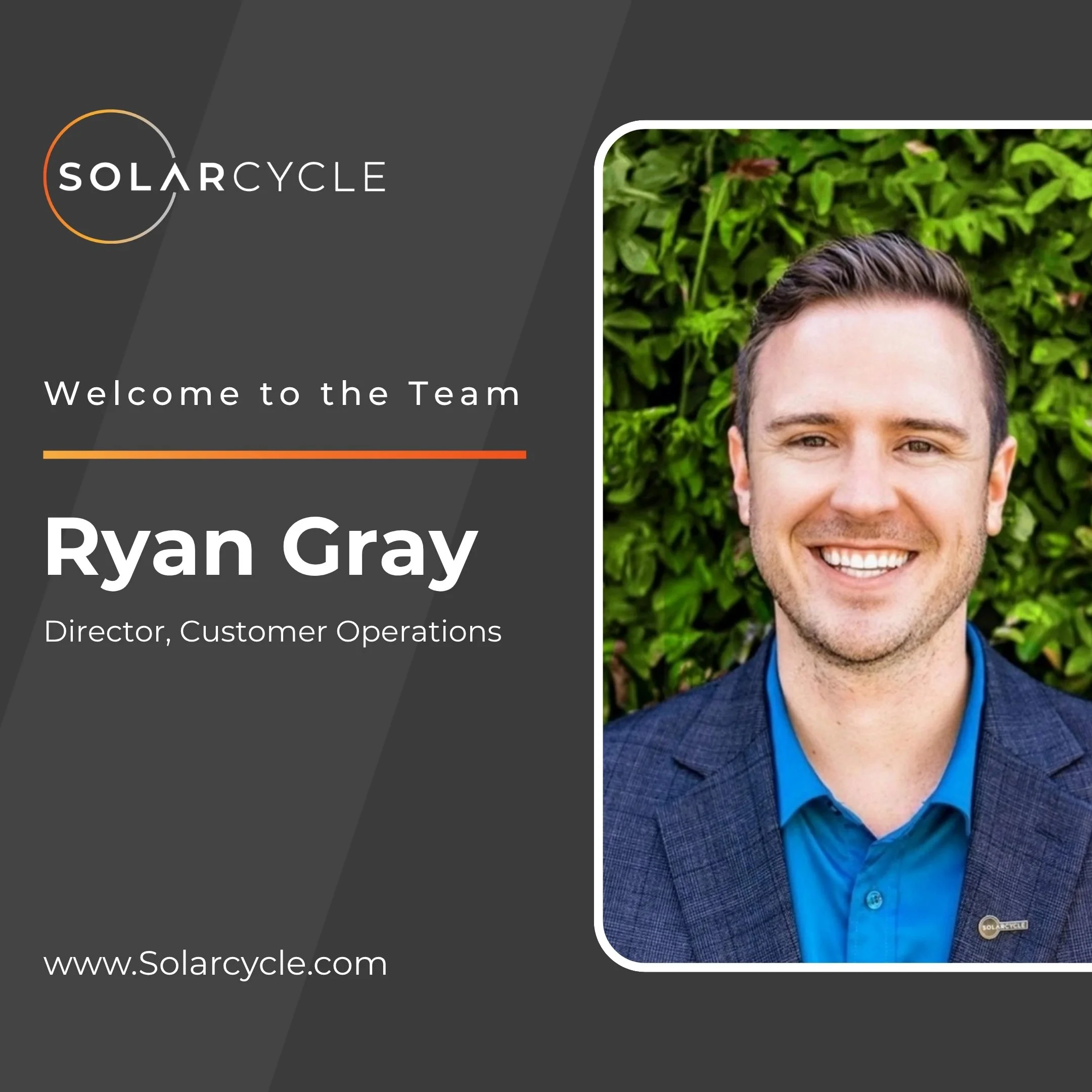
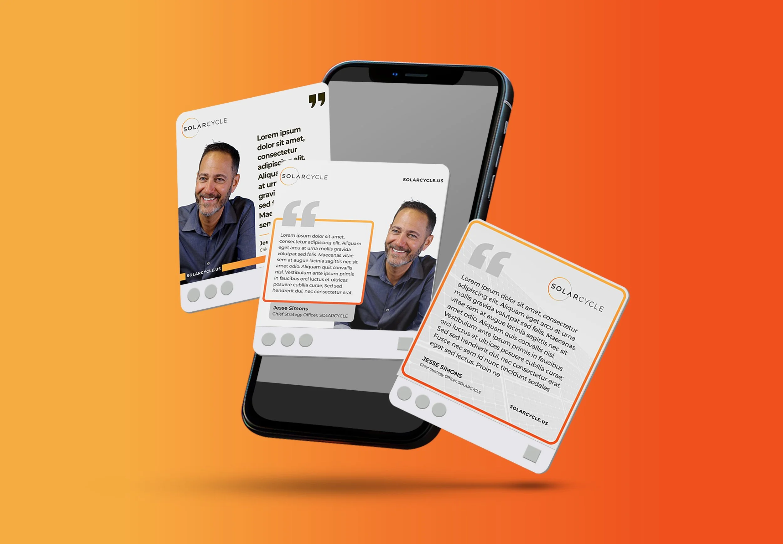
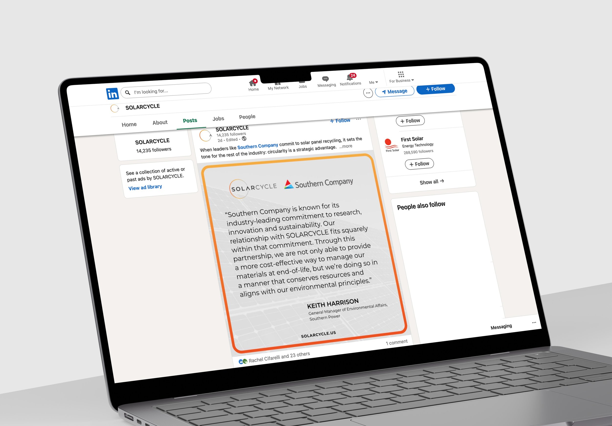
To echo the clean, tech-forward nature of Solarcycle’s sustainable manufacturing, I conceptualized a custom "UI Frame" container system for spotlights. The graphics display text within clean, rounded rectangular containers styled with minimalist gradients. This structural choice frames text as a polished digital dashboard component, giving ordinary text graphics a distinctive, high-end, look.
Typography & Heirarchy
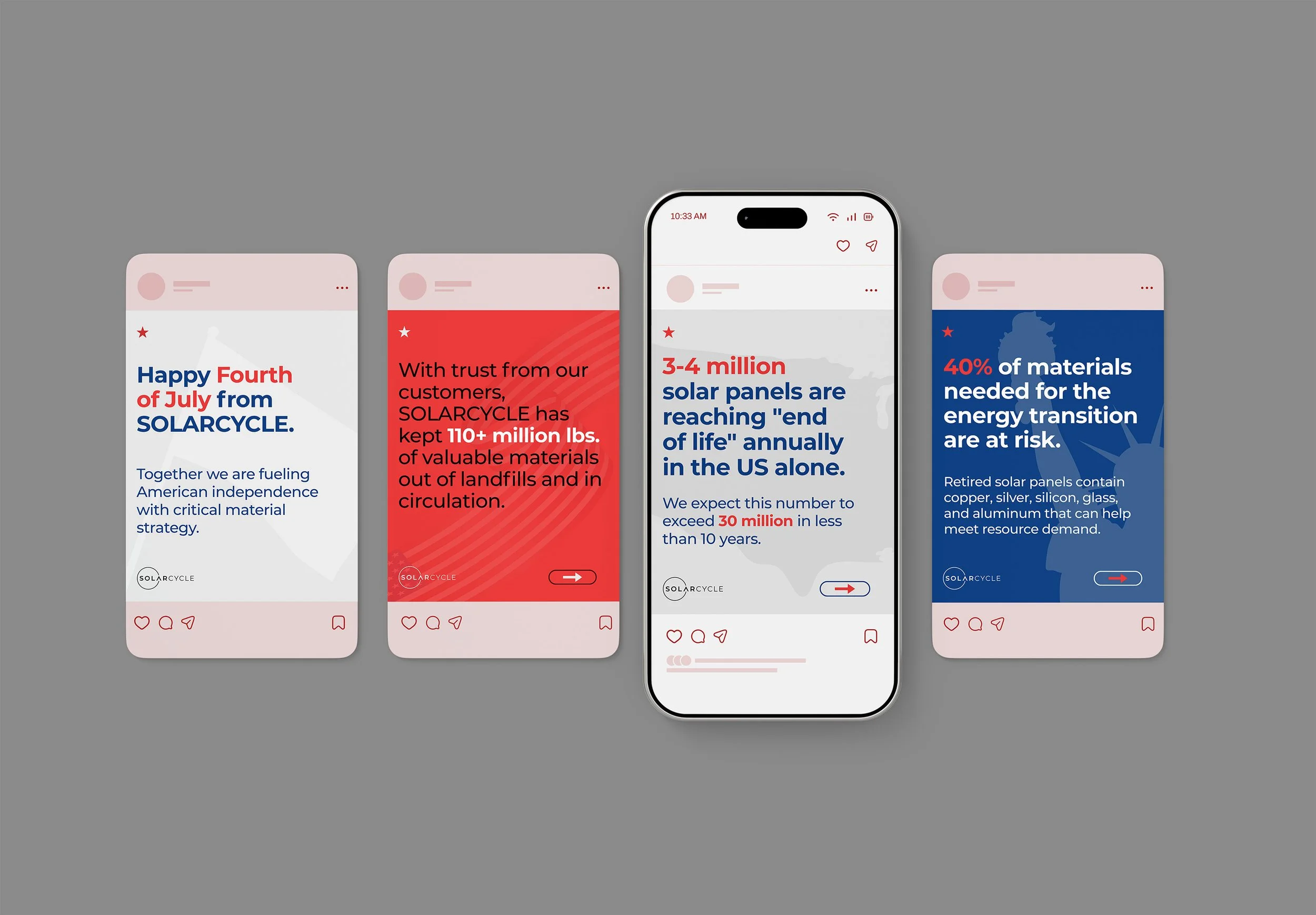
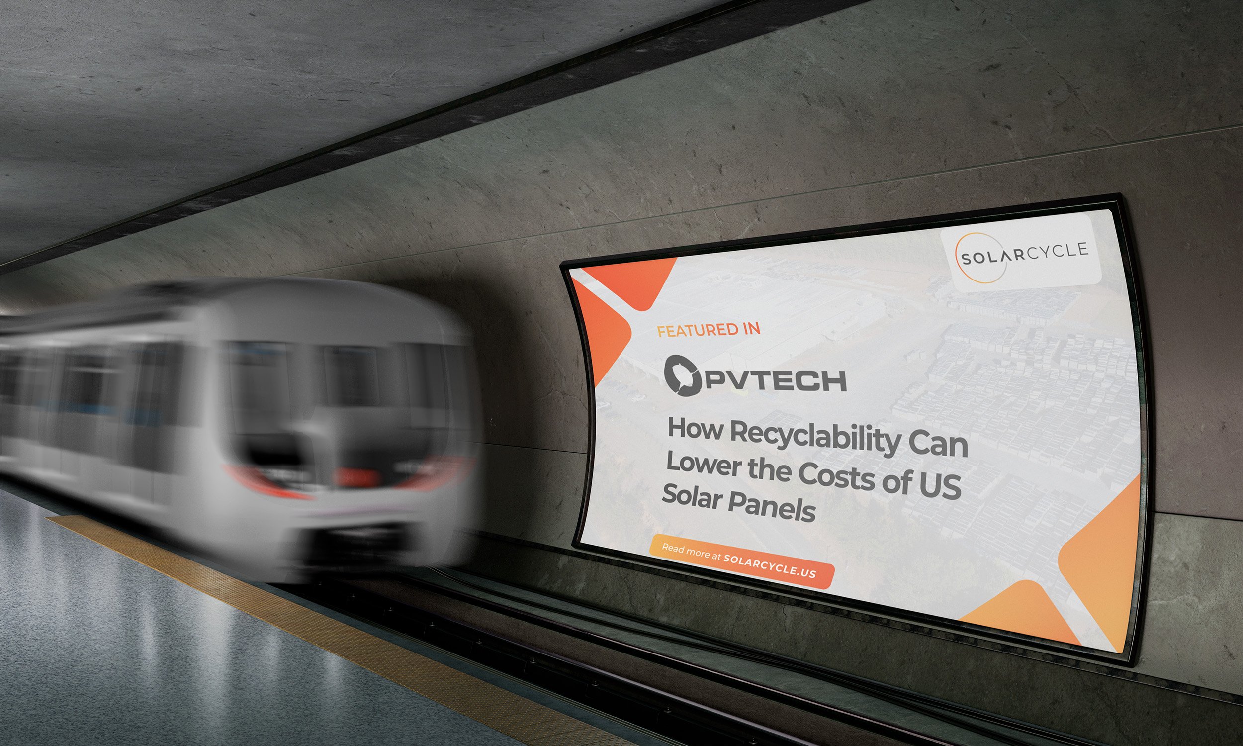
Without complex illustrations to rely on, typography served as the primary design tool. I established a rigid, mathematical grid hierarchy to maximize readability across variable screen sizes. Key metrics and announcement were heavily scaled up in size. By positioning bold black or white text against high-contrast, deeply saturated colored backdrops, the core message pops instantly. Color-blocking specific numbers apart from the standard body copy allows fast-scrolling users to digest Solarcycle's large-scale impact with a quick glance.
Color & Gradient
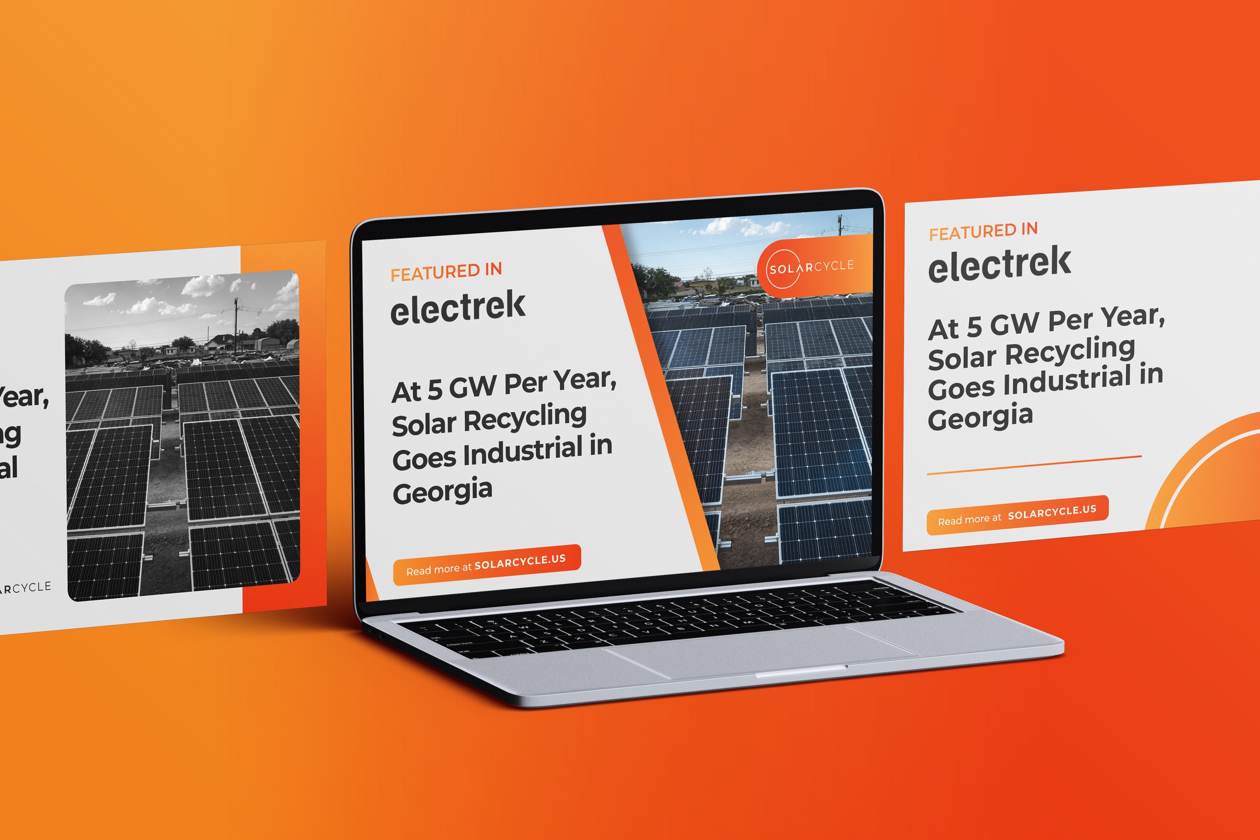
Vibrant orange can easily drown out text, signatures, and photographic portraits if used exclusively as a background fill. I isolated the energetic primary brand orange and its gradients to serve strictly as a frame. The content itself was set into clean, neutral gray and white panels. The bright corporate orange was pulled into these panels for small-scale accents such as bounding borders, quotation marks, underline anchors, and call to action links. This creates a clean ratio of whitespace to brand memorability.
01: Strategic Execution
02: Profile Optimization
LinkedIn Banner
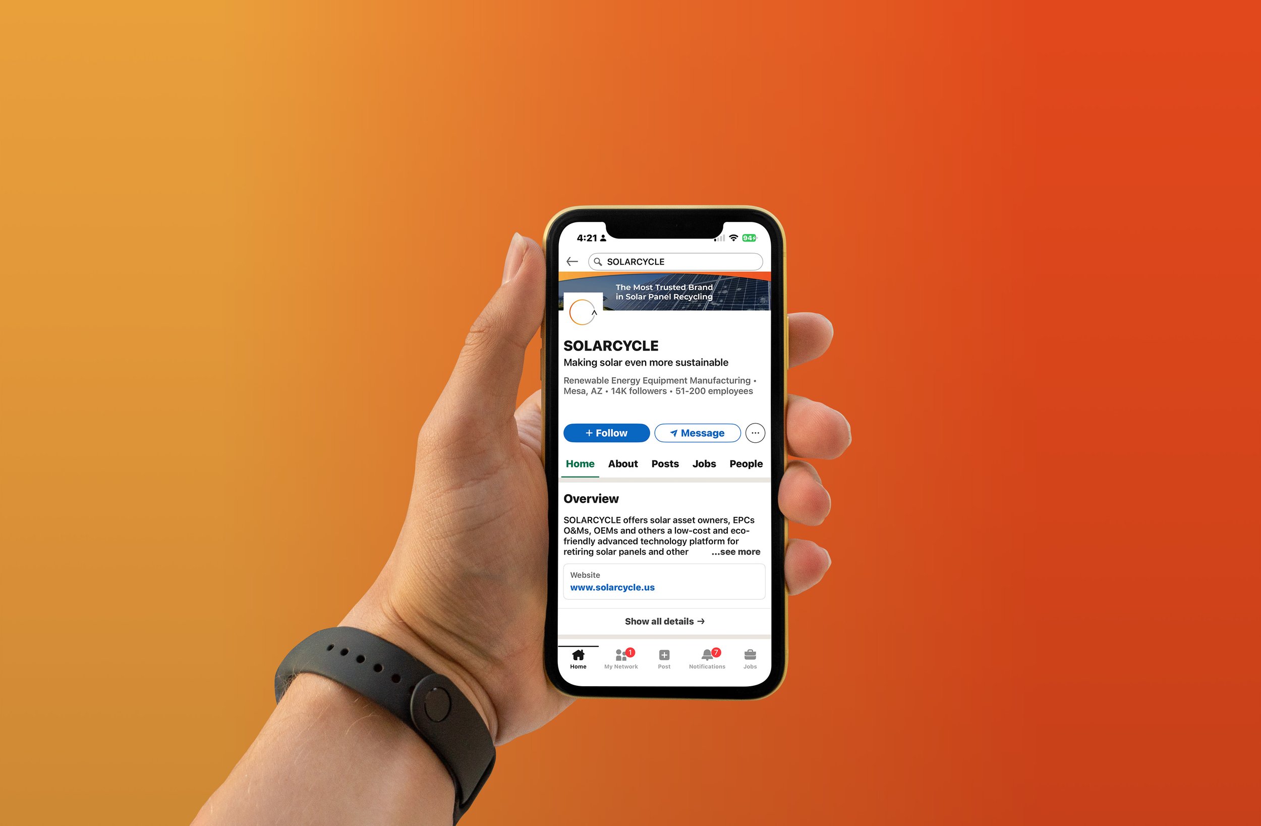
To finalize the cohesive digital visuals, I designed a corporate header banner tailored to wide, layout configurations. The header anchors the brand using a clean, solar panel background framed by the signature brand gradient striping. It clearly displays Solarcycle's mission statement: "The Most Trusted Brand In Solar Panel Recycling." This ties the the individual posts together, ensuring that a user transitioning from an individual square feed graphic back to the primary brand channel is greeted with a unified visual.
Widescreen Optimization
Beyond standard feeds, I engineered the design to expand naturally into widescreen presentation formats (16:9 aspect ratios) for pitch decks and keynotes. I adapted the geometric framing system to expand horizontally. The layout relies on centered typography, large negative space, and displays photography backgrounds with a low-opacity transparency layer. This provides layout flexibility, allowing the same unified branding to scale from a mobile device up to landscape corporate presentation files.
03: Systemization
Rather than designing single use graphics, I built a reusable, modular design engine that allows the internal marketing team to continuously deploy content:
Master Frame
Clean, responsive canvas templates optimized across four core aspect ratios: 1:1 square feeds, 4:5 vertical frames, 16:9 widescreen presentation formats, and profile headers.
Asset Masks
Pre-aligned portrait and image masks that keep headshots and industrial photography proportional to text blocks.
Interactive
Universal interaction buttons and brand logo watermarks positioned for visibility.
04: Impact
The final design system transformed Solarcycle’s digital graphics into a unified content hub. By balancing minimalist boundaries with layout frameworks, the final assets successfully amplified executive thought leadership, unified distinct thematic rollouts, and presented public relations wins with a polished image across mobile, desktop, and presentation sized formats.
Attribution
Brand identity, logo, and core assets were created by and belong to Rachel Cifarelli. Social media campaign and visual layouts were created by Otto Lukanic using brand assets.