
From Brand Book to Living Ecosystem
JUPITER
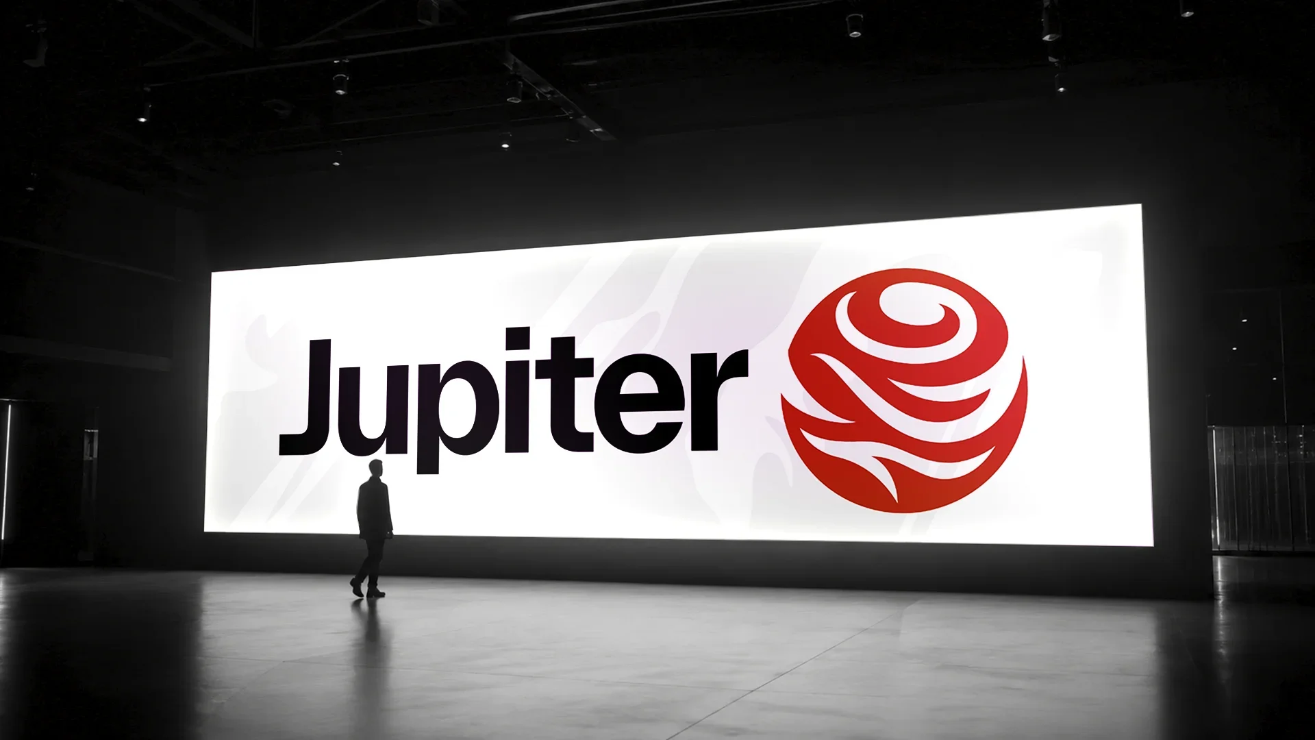
Jupiter partners with hyperscalers and Fortune 500s to turn retired servers, solar panels, hard drives and more, into reusable components and critical materials to build the next generation of technology. When I joined the project, Jupiter’s foundational visual identity such as the logo, color palette, typography, and core brand guidelines had already been established. My goal was to bridge the gap between a static brand book and a living, breathing company. Ahead of Jupiter’s public launch, I was asked to translate those guidelines into a cohesive ecosystem of digital, environmental, fleet, and print materials.
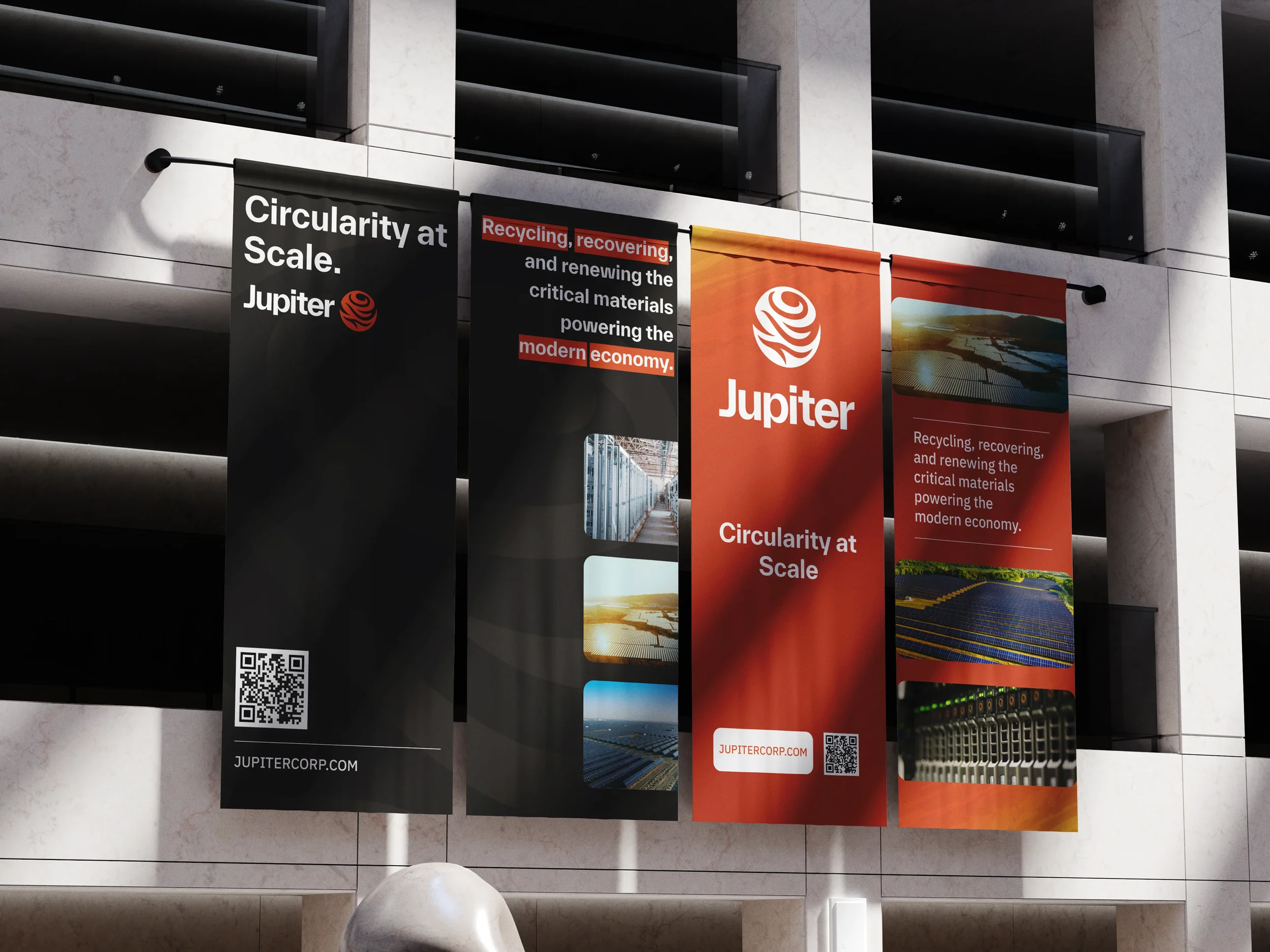
Working within an existing identity system presents a distinct creative challenge: how do you maintain brand consistency while adapting to various different formats, viewing distances, and audiences? It involves navigating extreme scale shift, balancing industrial aesthetics and forward thinking, and creating a modular, repeatable, and production ready system. Rather than treating each deliverable as a one-off design task, I approached the rollout as an interconnected system. I began by analyzing the existing brand kit to see where the rules were rigid (logo clear space, primary color ratios) and where there was room to build secondary visual language (graphic framing devices, data callouts, and iconography). Before designing individual pieces, I mapped out a layout architecture to define how headlines, photography, and brand themes different use cases.For physical deliverables like truck wraps and event banners, I mocked up designs in real world environments early on to test legibility at a distance and ensure key messaging wasn't lost to vehicle construction, doorways, or crowd views.
Branding
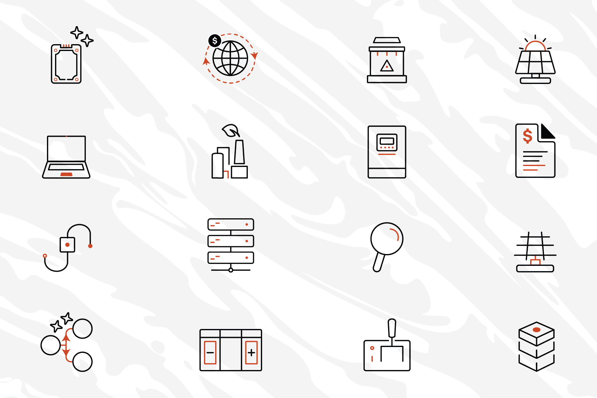
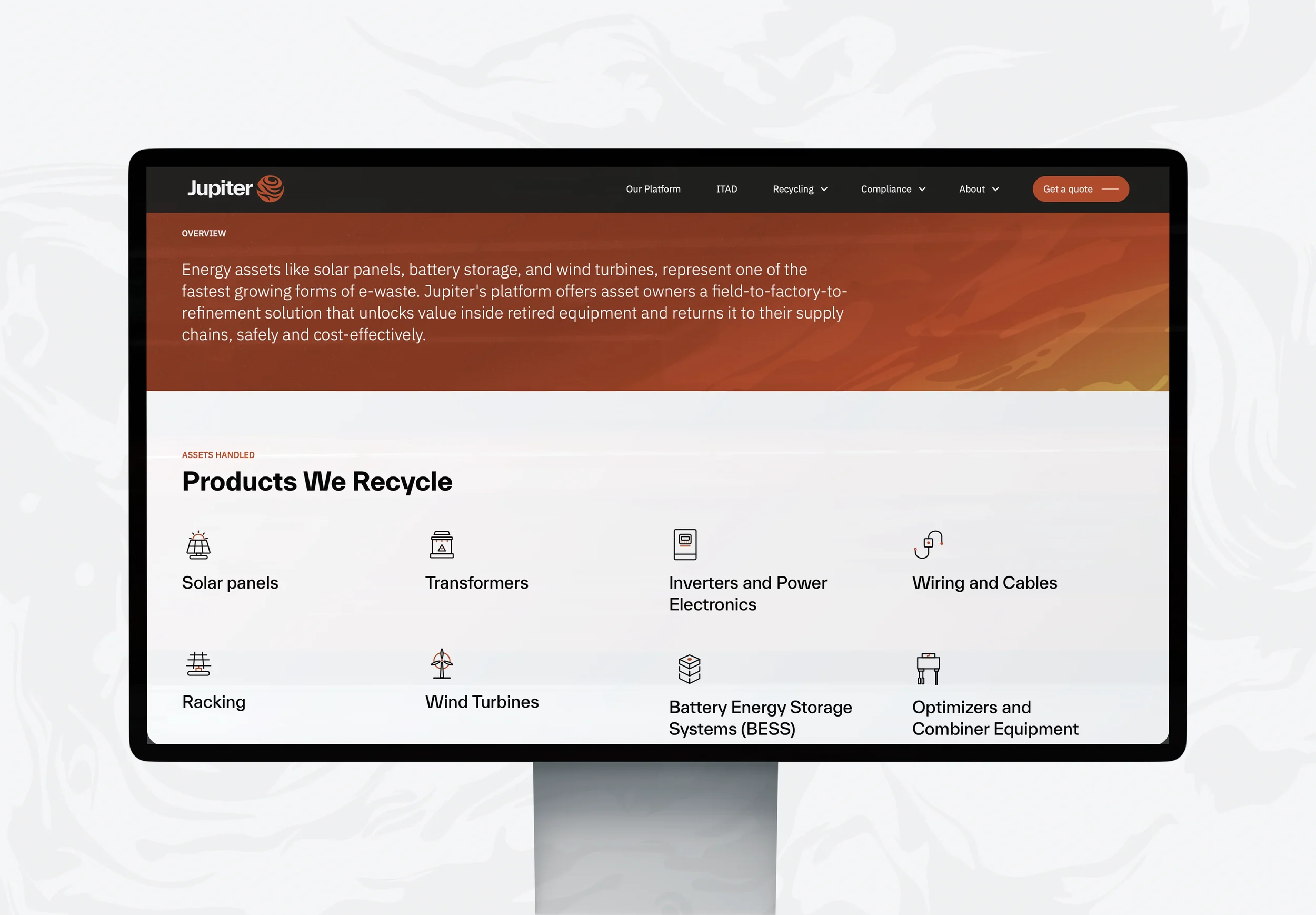
WEBSTIE ICONS

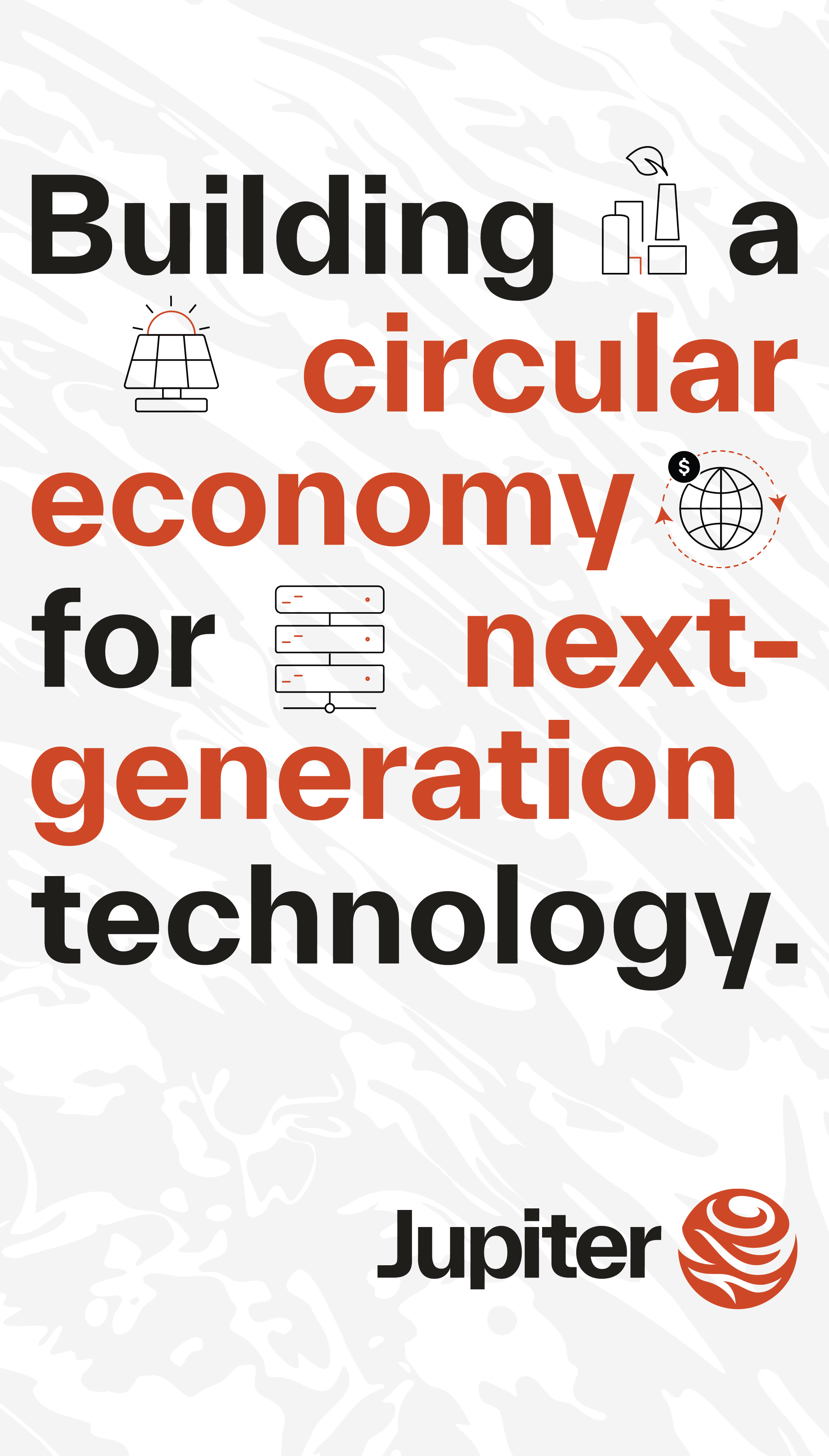
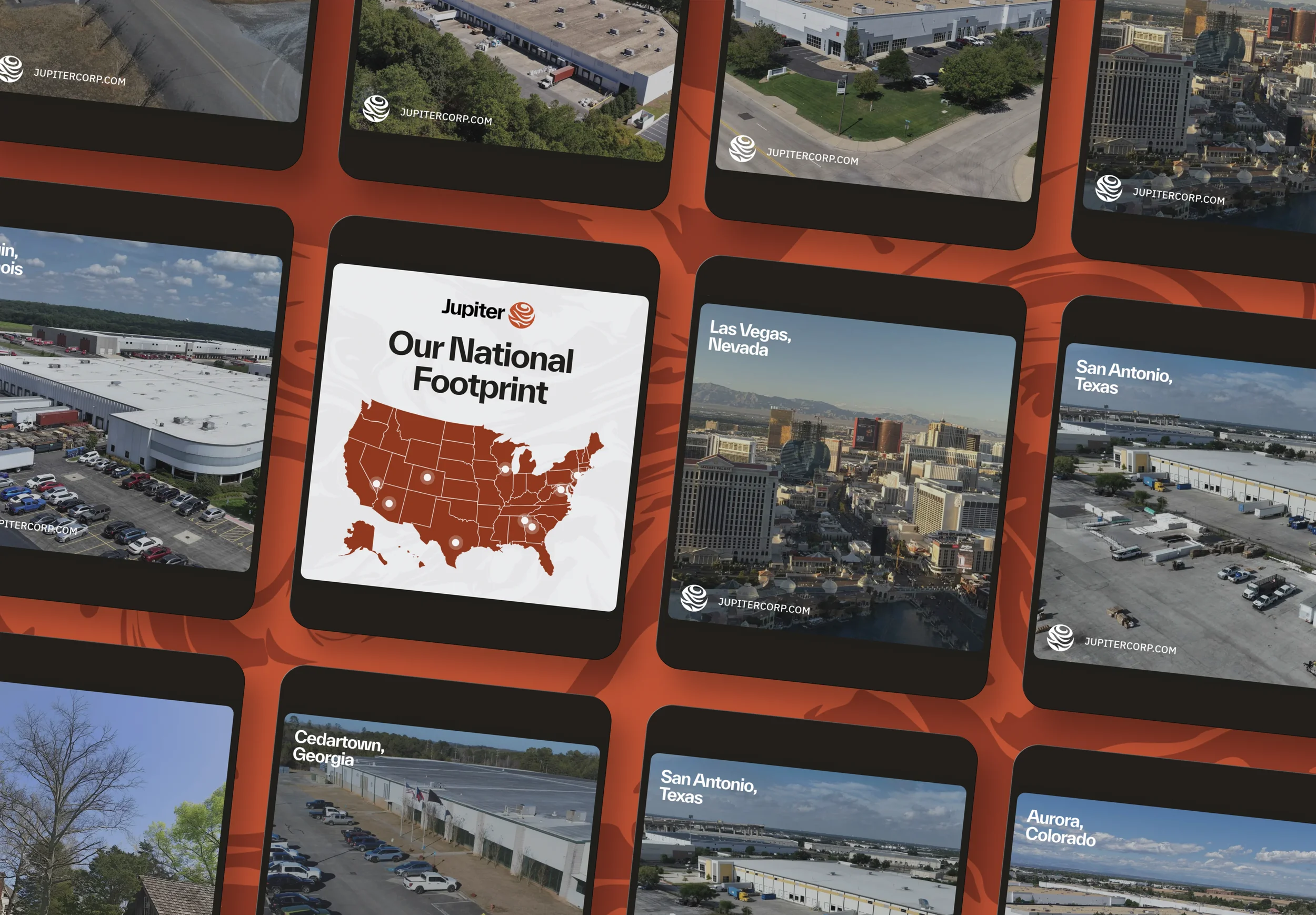
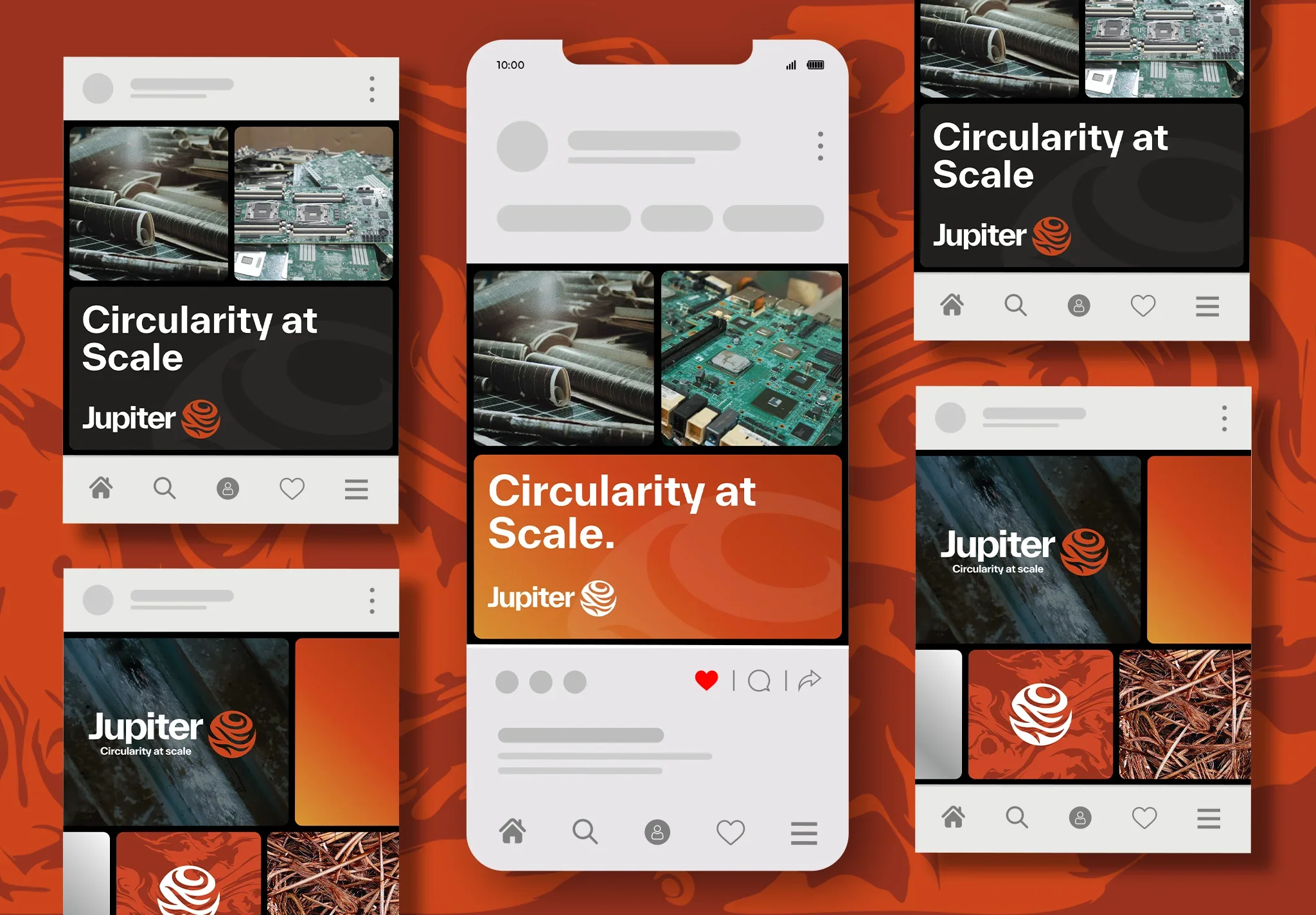
LINKEDIN BANNERS & SOCIAL POSTS





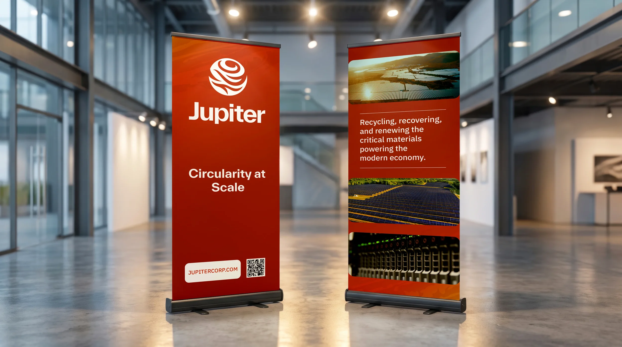
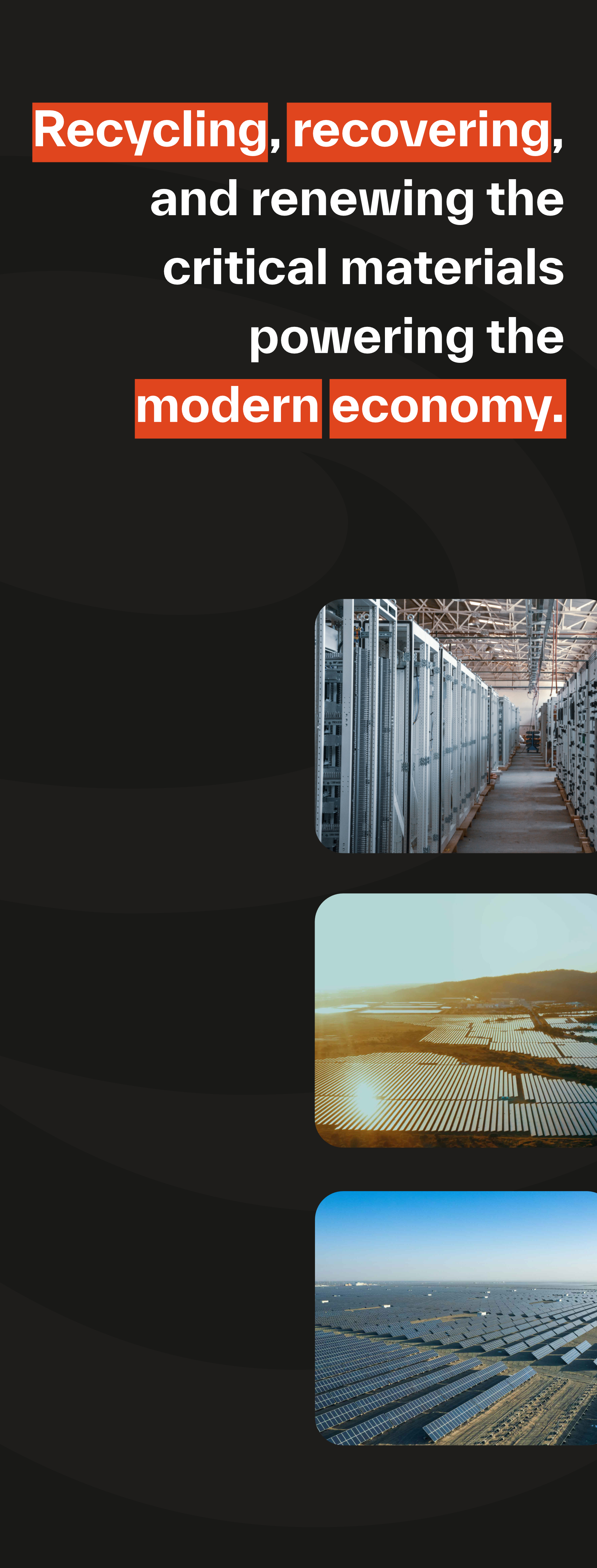
EVENT SIGNAGE



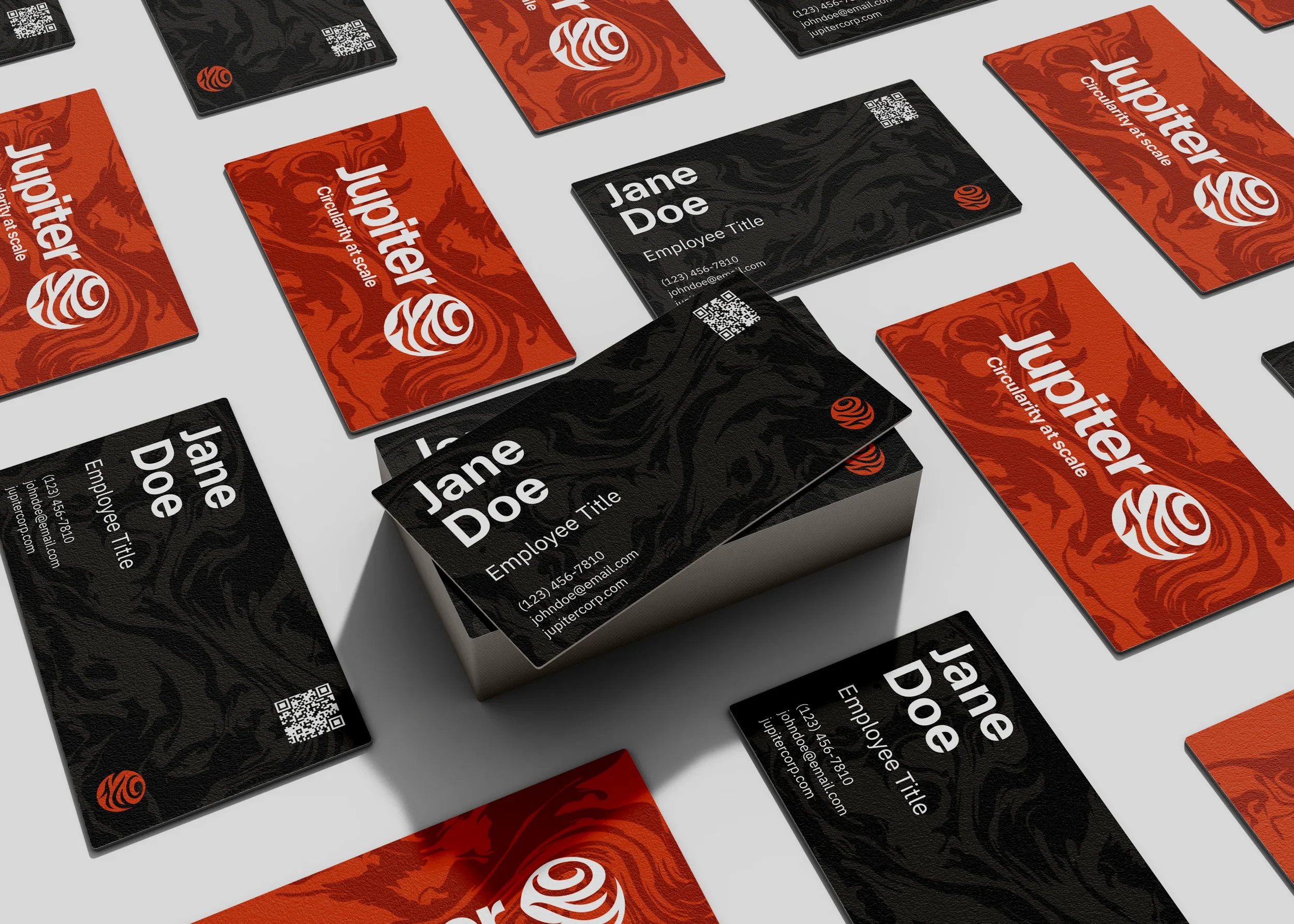
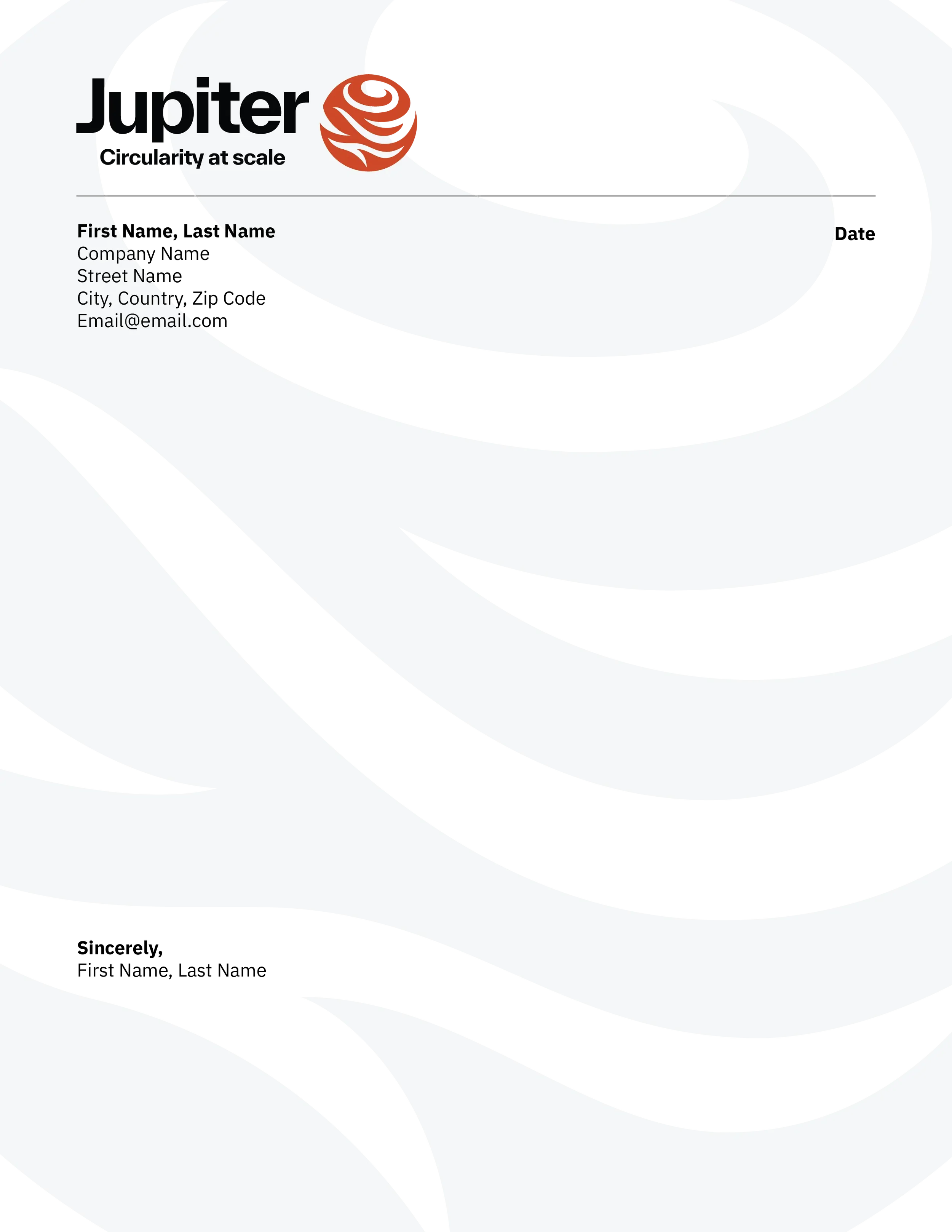
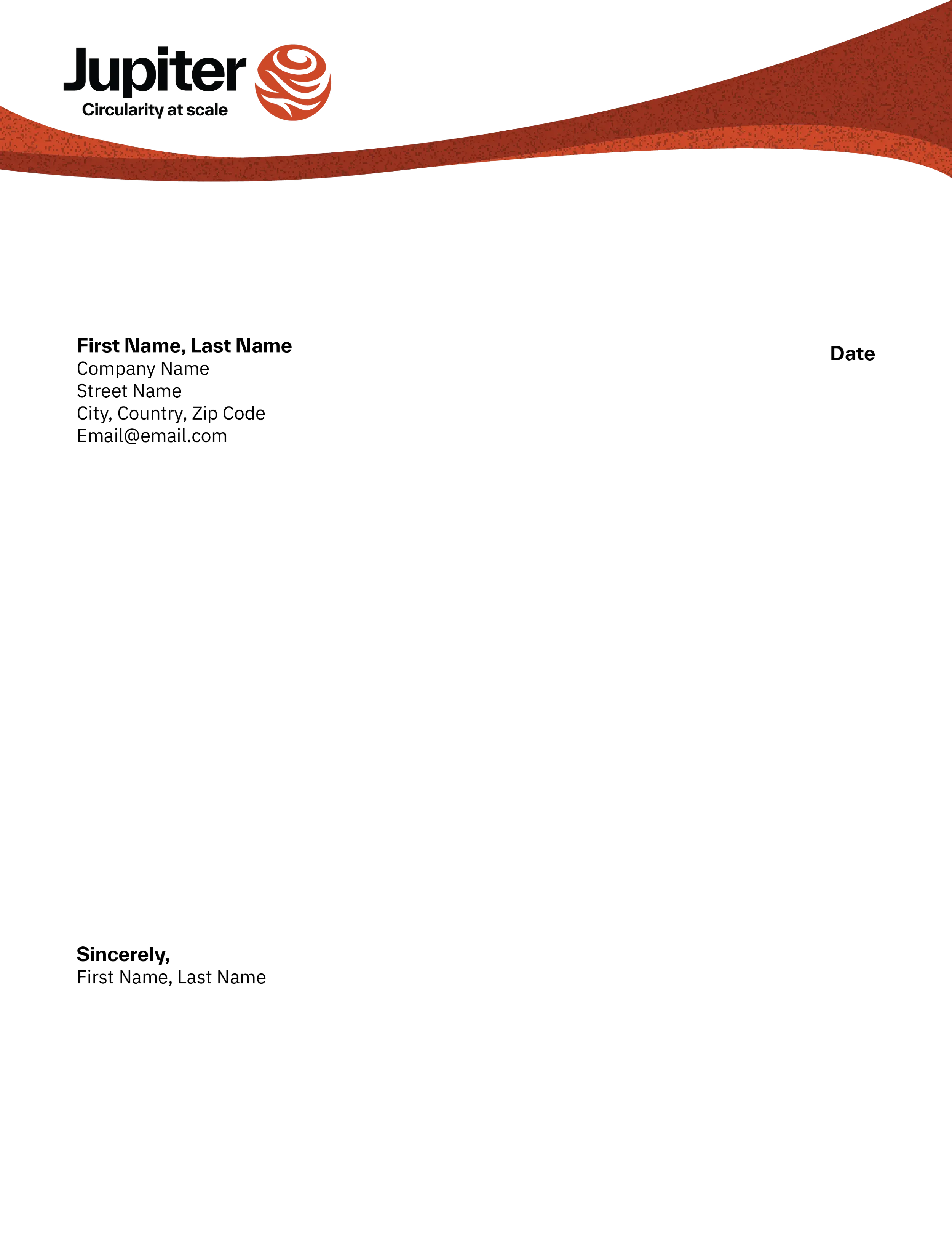
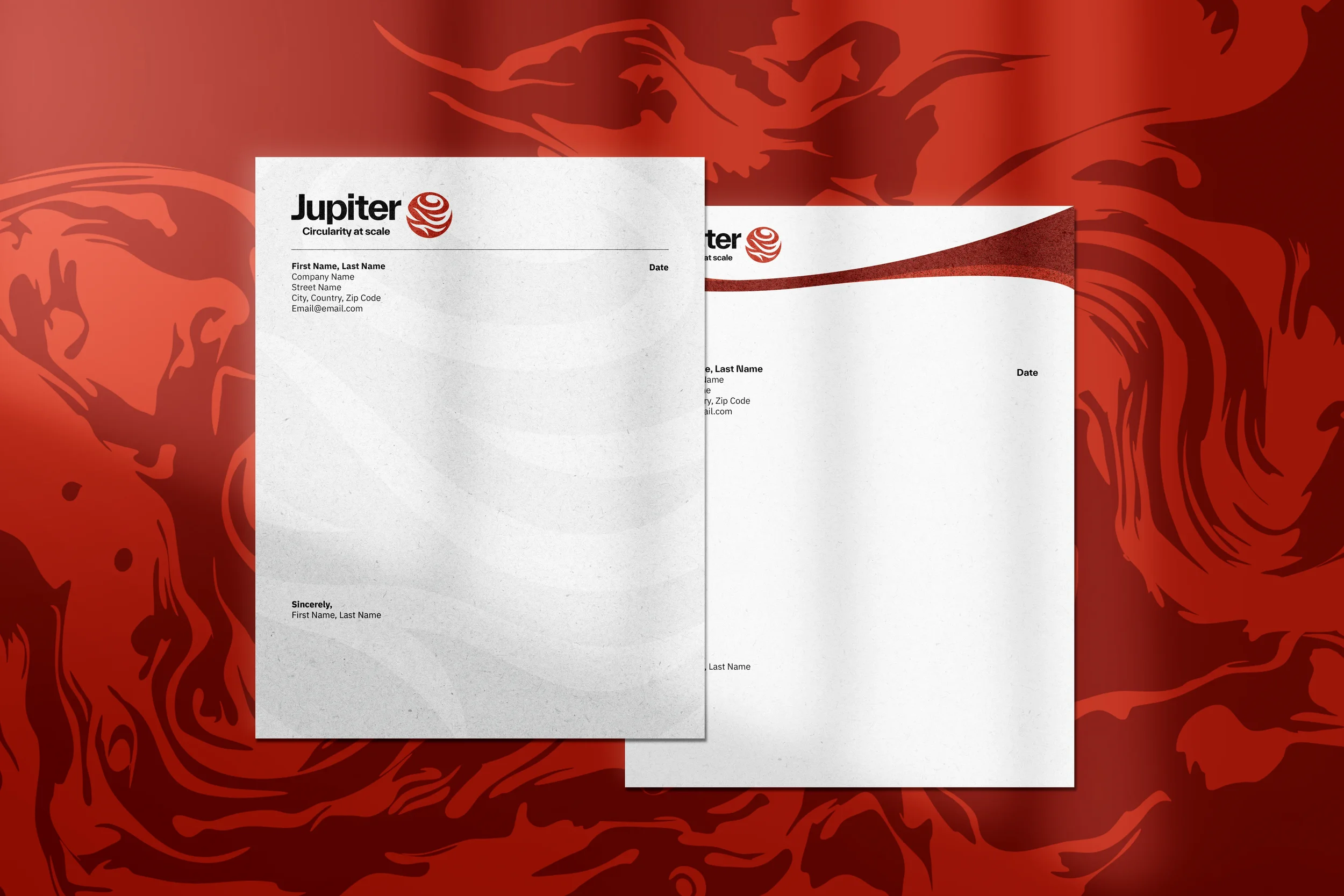
STATIONERY & BUSINESS CARDS
TRANSPORT TRUCK WRAPS

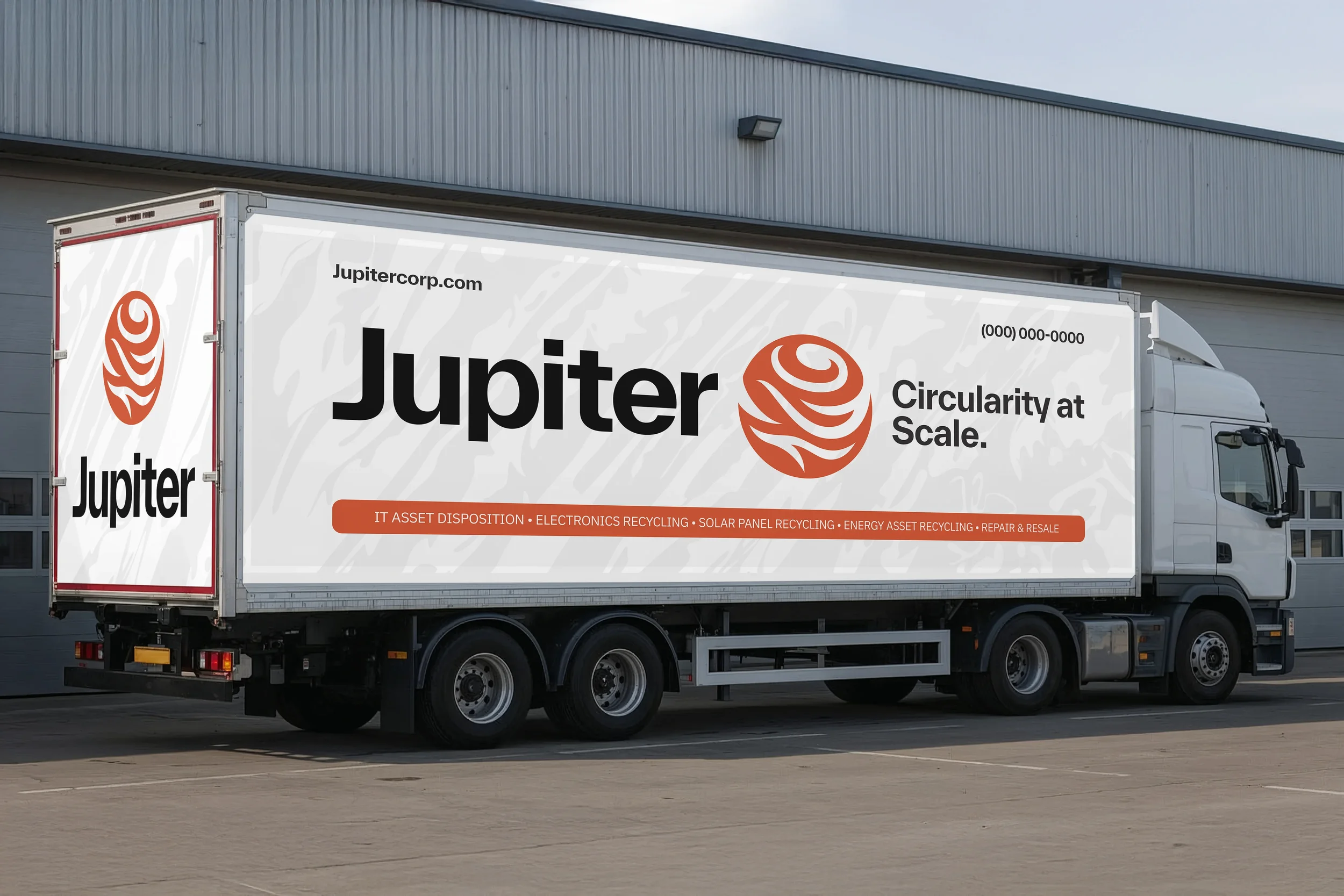
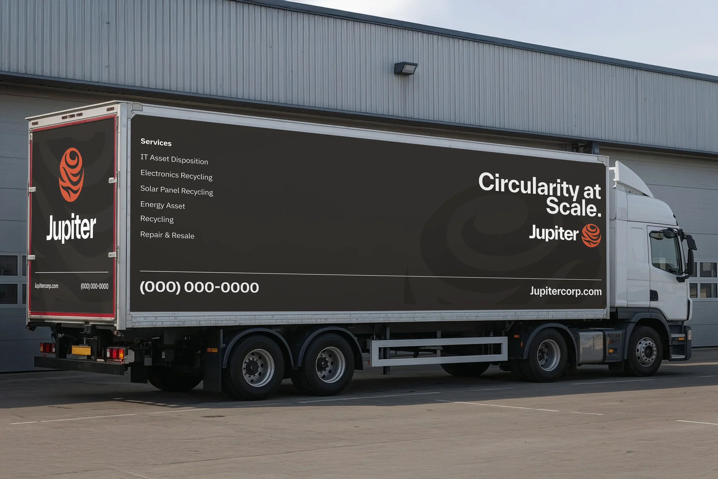

Designing across extremes, from 24px digital icons to full-scale vehicle wraps, reinforced the importance of building modular systems early. When your underlying grid and proportional rules are solid, scaling up or down becomes much faster and more intuitive.
Please note that Rachel Cifarelli is to be attributed for the design of the Jupiter Logos, color pallete, typography, and textures.